
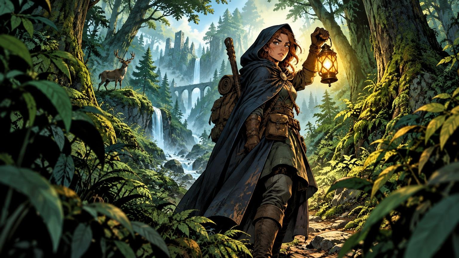
TLDR
A forest can be lush without giving every leaf equal authority. Protect the character’s silhouette, simplify the value directly behind the figure, assign different jobs to your greens and reserve the sharpest edges for the story. Test the painting in grayscale and at card size before polishing foliage. If the figure disappears, repair the silhouette and local value contrast before adding outlines, saturation or more glow.
The usual failure is not “too much green.” It is too much equality: the character, branches, moss and distant canopy all occupy similar values, edge sharpness and detail density. A fantasy forest character readable green palette begins with hierarchy. The viewer should recognize the figure and its action first, understand the forest second and discover the tiny mushrooms and suspiciously ornate bark third.
This order matters even more in small-format card art. Reduction removes leaf texture, facial features and subtle hue shifts. What survives is the large silhouette, the arrangement of light and dark masses, and perhaps one decisive accent. Build those first, and the forest can remain richly atmospheric instead of becoming green wallpaper.
Decide What the Image Must Say Before Painting Another Leaf
Write the focal story as one short action: “the ranger hears something behind her,” “the stag spirit emerges from mist,” or “the druid catches a green flame.” That sentence tells you which pose, prop and environmental cue must remain visible. If the action depends on a hand touching a glowing rune, do not bury that hand beneath vines simply because the vines are enjoyable to paint.
Reduce the scene to four or five flat shapes: the figure, one foreground mass, one background mass and perhaps a clearing or magical light. Hide every texture layer. The composition should still communicate where the character is, which way the gesture moves and what the character is reacting to.
This is also a useful moment to inspect the intended card crop rather than the full illustration canvas. A wide painting may have a beautiful fallen tree leading toward the hero, but that diagonal is useless if the card crop removes half of it. If the project centers on a famous creature or commander, the same story-first method used to build alternate art around a legendary creature’s defining moment can help identify what the crop must preserve.
Give the Character a Protected Silhouette
Readability is local. A pale cloak can disappear against mist, while a dark cloak can disappear against a cedar trunk. The figure does not need to be the lightest or darkest object in the whole painting; it needs meaningful contrast against the shapes immediately touching its important contours.
Start with the head, shoulders and action-bearing limbs. Place the face against a quiet patch of foliage, a light opening or a broad trunk whose value contrasts with the profile. Separate a raised weapon from vertical branches. Let antlers, wings or a familiar break into a calmer field rather than a thicket of similarly thin marks.
Then remove tangencies. A branch that ends exactly at the character’s eye, a sword aligned with a sapling or a cloak edge fused to a root can make unrelated shapes appear joined. Move, shorten or soften the competing object. You usually need only a few protected intervals around the silhouette, not an empty halo surrounding the entire hero.
I would resist outlining the complete figure in black or light. A continuous outline can separate the character, but it can also flatten the figure into a sticker. Instead, strengthen contrast selectively around the face, gesture and key prop, then allow less important edges to merge naturally into shadow.
Build Depth With Planes, Overlap and Scale Cues
Forests rarely offer tidy streets of trees marching toward a vanishing point. Depth often reads more convincingly through overlap, size change, atmospheric softening and alternating openings and barriers.
Organize the scene into at least three practical planes. The foreground can contain one dark root, leaf cluster or trunk that frames the action. The character plane carries the figure and the clearest story information. The background uses larger, quieter masses with less edge contrast. A path, stream, sequence of stones or diminishing trunks can connect those planes without turning the woodland into a perspective diagram.
Give scale cues a purpose. A tiny shrine makes an ancient tree feel vast. A few broad leaves close to the viewer make the character feel deeper in the scene. A distant bird or broken tower can expand the world, but only if it remains subordinate. At card size, one clear overlap often explains more depth than twenty carefully rendered background branches.
Paint the Value Plan Before the Green Palette
Color variety cannot rescue weak value grouping. Begin with a simple arrangement such as a dark forest mass, a middle-value figure and a light clearing. Another scene might use a light figure against a middle forest, framed by a dark foreground. The specific arrangement can change; the need for distinct connected masses does not.
James Gurney’s discussion of grouping tonal values into connected masses is particularly useful here: objects do not each need their own isolated light-dark statement. Grouping nearby forms into broader light and shadow families gives the eye a structure it can recognize quickly.
Make a grayscale layer or preview and reduce the image until individual leaves stop reading. Photoshop documents grayscale as brightness values ranging from black to white, but the artistic purpose of this check is simpler: remove hue as a distraction and inspect the value pattern. Ask whether the head separates from its background, whether the gesture remains intact and whether a bright clearing is stealing attention from the character.
Do not demand maximum contrast around every contour. Concentrate it where recognition happens first. The face might have a light patch behind it while the lower cloak dissolves into shadow. That lost edge can increase atmosphere and make the surviving head-and-shoulder silhouette feel more deliberate.
Give Every Green a Job
A controlled green palette is not a fixed number of swatches. It is a division of labor. Establish a deep neutral green for the forest core, a middle local green for recognizable foliage and a lighter, warmer or cooler green for leaves catching illumination. Add near-neutrals for bark, stone, mist and worn fabric so the eye can rest.
Foliage does not need uniform internal value. Gurney notes that foliage in indirect light tends to appear lighter around outer and upper edges and darker through its bases or cores. Treat a bush or canopy cluster as a volume: darker where leaves collect into depth, lighter where the mass turns outward. This produces readable foliage without describing every leaf.
Reserve the cleanest temperature or complementary contrast for the story-bearing event. A restrained rust-red scarf, violet spell or warm face against cool vegetation can identify the character more effectively than making every green more saturated. Software palette tools can help preserve selected colors and explore analogous, complementary or split-complementary relationships; Procreate, for example, documents saved palettes, value controls and several harmony modes. These tools organize choices, but the focal hierarchy still comes from your judgment.
If the scene feels muddy, first reduce the chroma of secondary foliage rather than pushing the character toward fluorescent color. Mud often comes from too many areas competing at similar intensity, not from insufficient saturation.
Choose Lighting That Supports the Story
A backlit clearing
A pale opening behind the upper body can produce immediate figure-ground separation. Keep its shape broad and quiet. If the gap becomes a lacework of bright twigs, the silhouette loses its protection. This setup suits an arrival, revelation or threatening emergence.
A side-lit forest lane
Side light can turn the face, hand and nearest folds while leaving the opposite side merged with the woods. It feels less theatrical than a full halo and gives trunks and roots enough directional light to describe depth. Use the strongest lit edge near the action, then soften it as it travels away.
A local magical source
A lantern, rune, spirit or spell can separate nearby forms while explaining unusual color. The illumination should affect surfaces according to proximity and orientation. Light the hand holding the spell, the underside of the chin and nearby leaves; do not sprinkle identical green highlights across the entire forest.
Visible sunbeams require a coherent setup. They are associated with openings in the canopy, particles in the air and a view oriented toward the light, while the values beyond a bright shaft can appear lifted. A beam should therefore describe space and direct attention, not become a random pale stripe behind the hero.
Spend Detail Where the Story Needs It
Detail is a budget. Spend sharp texture around the face, hands, creature head, important prop or magical interaction. Use larger brush shapes and quieter edges in secondary foliage. One carefully placed fern overlapping a boot can establish the environment; forty equally sharp ferns can turn the character into a search puzzle.
Vary material information rather than rendering everything with the same leafy noise. Let wet bark carry long subdued highlights, moss form soft grouped patches and metal catch one hard accent. These differences make the focal zone feel specific while allowing the wider forest to remain suggestive.
Watch the edges of the character as you texture the environment. A cluster of leaves whose gaps repeatedly cut into the face or weapon can destroy the silhouette even when its average value differs. Simplify that cluster into one mass, soften it or shift it behind a less important part of the figure.
Run the Thumbnail and Grayscale Repair Test
View the art at the intended final size, not only as a full-screen painting. There is no universal thumbnail dimension for every card or digital use, so test the actual crop and viewing context. If you are designing alternate art, place the image temporarily inside the intended frame; the full proxy card design can reveal whether frame elements or text regions change the apparent balance.
Perform repairs in this order:
- Fix the silhouette of the head, gesture and defining prop.
- Change the value immediately behind the failing contour.
- Remove or soften competing foliage detail.
- Strengthen one focal edge, light accent or small color contrast.
- Adjust hue or saturation only after the value structure works.
This sequence prevents a common cycle in which the artist keeps adding bright green, pale outlines and glowing dust while the original compositional problem remains untouched. If the figure reads in small grayscale, color can enrich it. If the figure fails there, color is being asked to perform rescue work it cannot reliably do.
Finish Without Flattening the Hierarchy
The final pass should increase selectivity, not uniform polish. Avoid universal rim light, globally lifted shadows, blanket saturation and equal sharpness across the canvas. Recheck the brightest light, darkest dark, sharpest edge and cleanest color contrast. If all four occur in different corners, the painting may be telling four stories.
For card artwork, make one final crop-sized check after sharpening or other output edits. Soft proofing can preview output through a selected profile, but Adobe cautions that the preview depends on the monitor, output profile and ambient lighting. Treat it as one preview step and follow the requirements of the intended output provider rather than assuming one setup fits every project.
Once the illustration reads at its final viewing size, creators turning it into a custom card can move from art direction to custom MTG card production. Keep a clean master file and export to the current specifications of the chosen provider instead of building unverified bleed or resolution assumptions into the painting workflow.
The Decision That Fixes a Muddy Forest
Reduce the scene and ask one blunt question: can you identify the character and action before you notice the foliage texture? If not, return to the silhouette and the value directly behind it. Simplify one competing mass, protect one important contour and reserve one contrast for the focal story.
That is the reliable route to a fantasy forest character readable green palette. Keep the many greens if they serve depth and atmosphere. Just do not let every leaf audition for the leading role.