
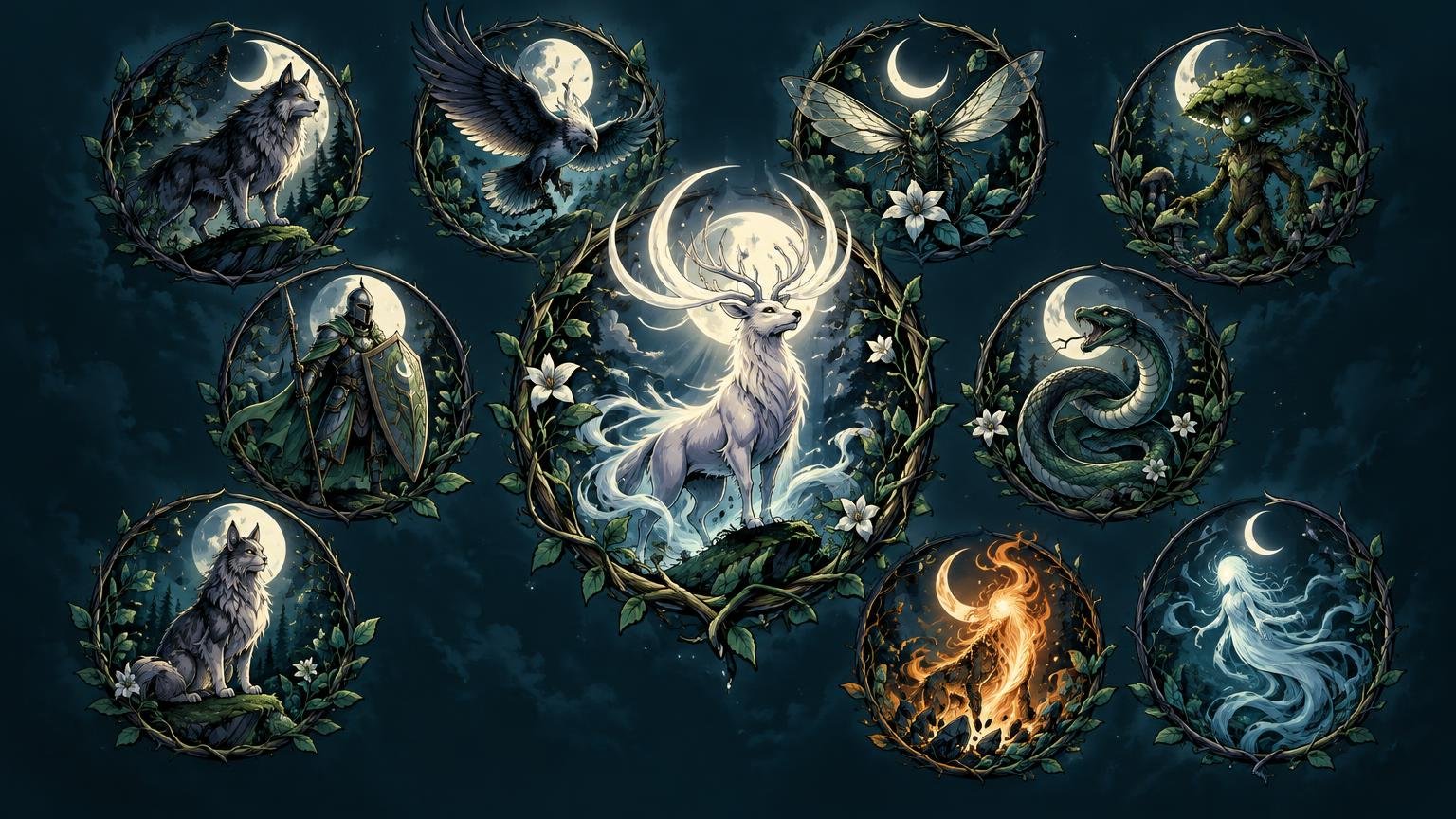
TL;DR: To art direct custom MTG token set artwork, define one mood sentence, three recurring motifs, three exclusions and fixed rules for palette, value and light. Let each token keep a distinct silhouette and action, reserve one controlled exception for the hero token, and review all ten designs together at final card size before polishing any single image.
A Soldier, Spirit and Treasure token should not look like the same actor wearing three hurried costumes. Yet they should appear to inhabit the same world. The trick is consistency without sameness: repeat the visual laws of the setting, not the entire composition. Shared materials, weather, light and shape language create the family resemblance; different poses, silhouettes and focal stories preserve gameplay recognition.
Start with the world, not the token list
Before naming individual creatures or objects, write one sentence describing what the whole set should feel like. Include an emotional temperature, a place or culture, dominant materials, weather or light, and a sense of motion.
For example: “A wind-scoured border kingdom builds sacred machines from black iron and blue glass, seen at dusk as cold magic pushes against warm forge light.” That sentence already gives ten illustrations something to agree about. It suggests hard surfaces, restrained ornament, diagonal movement, cool environments and warm focal accents.
Avoid a mood statement made only from broad genre labels such as “dark fantasy” or “epic medieval.” Those phrases permit almost anything. A useful direction excludes more than it includes. “Quiet woodland spirits formed from pale bark and moth wings under diffuse moonlight” is much harder to misunderstand.
Large Magic settings are also developed through coordinated worldbuilding, art direction, concept work and reference guides rather than by treating every illustration as an isolated event. Wizards’ account of Ikoria describes a concept push that produced reference imagery and world guides for illustrators. The official Ikoria worldbuilding account is a useful example of the principle at a larger scale. Your token guide can be much smaller, but it should perform the same job: establish what belongs in this world.
Choose recurring motifs and firm exclusions
Select three motifs that can reappear without becoming a scavenger hunt. One might be a material, one a shape and one an atmospheric effect. For the border-kingdom example, I would choose riveted black iron, narrow triangular banners and blue sparks carried sideways by the wind.
Then choose three exclusions. These are the guardrails that stop an attractive image from wandering into another setting. Exclusions might be polished gold, round cheerful architecture and bright midday skies. They do not need a lore explanation; their job is visual discipline.
A motif should change form according to the subject. The triangular shape might appear as a Soldier’s shield, the negative space between a Beast’s horns and the cut of light behind a Spirit. Repeating the exact banner in every scene would feel like branding pasted onto the world. Repeating its geometry makes the world feel designed.
Set separate rules for palette, value and lighting
Color, value and light are related, but they solve different problems. Palette establishes family resemblance. Value—the arrangement of light and dark—controls readability. Lighting explains the physical world and directs attention. Write one rule for each rather than hiding all three beneath “use blue and orange.”
| System | Shared rule | Allowed variation |
|---|---|---|
| Palette | Desaturated blue-black environments with warm copper focal accents | Token categories may receive a small secondary hue |
| Value | One dominant dark mass, one readable midtone subject and a limited bright accent | Spirits may be lighter overall if their outer silhouette remains clear |
| Lighting | Cold dusk from above-left; warm practical light near the subject | The hero token may use stronger backlight and deeper foreground shadow |
| Texture | Weathered metal, chipped stone and wind-softened fabric | Treasure can be cleaner, but never mirror-polished |
At card size, value structure usually does more work than delicate color shifts. Temporarily desaturate each image and shrink it. If the subject dissolves into the background, separate the large masses before adding detail. Brightening every edge is not the answer; that produces a nervous halo. Instead, place the strongest contrast around the face, weapon, spell or object that explains the token in one glance.
I would also reject tiny isolated highlights scattered across every buckle, leaf and tooth. They turn the contact sheet into glittering static. Let one area carry the sharpest light, then allow the rest of the rendering to support it quietly.
Give every token a distinct silhouette and focal story
Continuity should live in the world’s construction, not in repeated poses. Build a simple role statement for each token: “Soldier braces against the wind,” “Treasure protects a captured ember,” or “Spirit rises from a broken oath-stone.” That statement gives the composition a verb.
Next, assign each category a dominant silhouette. A Soldier might be a narrow upright wedge; a Beast a low horizontal mass; a Spirit a loose ascending spiral; and Treasure a compact geometric cluster. These shapes should remain recognizable when filled with solid black. If Soldier and Zombie both become centered human figures from the waist up, costume details will struggle to rescue them during play.
Use continuity rules to connect those different shapes:
- Characters share the same angular armor construction and limited copper trim.
- Creatures develop ridges or horns that echo the kingdom’s triangular architecture.
- Objects use the same iron fasteners, blue glass and chipped stone seen in environments.
- Fabric and smoke bend in one prevailing wind direction.
- Backgrounds use low horizons, distant towers and broad areas of quiet sky rather than crowded scenery.
The set can even contain multiple rendering styles if its deeper visual grammar remains stable. If that is part of the plan, use the same kind of shared constraints described in the guide to mixing fantasy art styles without visual chaos. Variation becomes convincing when the palette, shape language and hierarchy continue to agree.
Plan one controlled exception for the hero token
Choose the most important or rare token before finishing the set. It may represent a signature creature, an emblematic object or the payoff the deck is built to create. Give it an exception, but change only one or two variables.
A hero Beast could keep the shared dusk palette, black iron ornament and leftward wind while receiving a lower camera, larger scale and brighter rim light. A special Treasure could retain the same compact silhouette and materials but gain more negative space and one richer copper accent. It should look like the climax of this world, not a visitor from a more expensive world.
Do not reward importance by maximizing everything. Extra ornament, saturation, contrast, particles, dramatic perspective and glowing eyes used together will make the token shout in six dialects. Pick the exception that expresses its gameplay importance most clearly.
Build the contact sheet before polishing
Place all ten rough designs in a two-by-five or five-by-two grid using the same crop ratio. Add only short labels. The purpose is to judge relationships, so avoid large captions, decorative frames or presentation effects that conceal weak artwork.
Run four passes:
- Blur or squint: Do the large value masses feel related, and does each token retain one obvious focal area?
- Silhouette: Fill each subject with black. Can you distinguish the token categories without interior detail?
- Sequence: Scan the row quickly. Does one image become accidentally dominant because it is brighter, busier or more saturated?
- Card size: Place every rough inside the intended artwork crop and view the cards at realistic tabletop size. Can you identify the subject, action and important material in roughly a glance?
The artwork crop is not the whole card canvas. A strong uncropped painting can lose its weapon, gesture or creature scale once placed behind a frame and text elements. Check the finished card hierarchy as well as the illustration itself; the broader card-design guide explains why excellent art can still produce a weak card when the surrounding information competes with it.
When one image fails the contact-sheet review, diagnose the violated rule before repainting it. If it feels imported, compare palette, material and lighting. If it belongs to the set but cannot be recognized, compare silhouette, crop and focal contrast. This distinction prevents a common mistake: forcing every outlier toward the same centered portrait composition.
Turn the decisions into a mini style guide
Your final guide can fit on one page. It should be specific enough to make decisions but short enough to remain visible while drawing. If several artists are involved, expand it with concrete references and handoff notes using the workflow in the mini style-guide guide for multi-artist deck projects.
One-page token style guide checklist
- Mood sentence: emotional temperature, setting, materials, weather or light, and motion.
- Three recurring motifs: one material, one shape and one atmospheric behavior.
- Three exclusions: colors, forms, finishes or scene types that do not belong.
- Palette: dominant neutrals, focal accent and any token-specific secondary hues.
- Value rule: location and approximate size of the darkest mass, midtone subject and brightest accent.
- Lighting rule: source direction, temperature and permitted exceptions.
- Silhouette map: one clearly different dominant shape for each token category.
- Continuity notes: anatomy, clothing, architecture, objects and environmental traits.
- Composition range: which camera distances and angles prevent repetitive staging.
- Hero exception: the token receiving it, the variables that change and the rules that remain fixed.
- Contact sheet: all ten current crops shown together at card size.
- Rights record: artwork creator, source, agreement and intended reproduction or sharing uses.
Keep artwork rights inside the plan
Use original work or artwork for which the intended use has been permitted. The U.S. Copyright Office explains that illustrations are protected visual works, that the creator is generally the initial copyright owner, and that commission agreements should clarify intended uses. Its copyright guidance for visual artists is a useful starting point. A paid commission should not be treated as automatically granting every reproduction, printing, sharing or commercial right; put the agreed uses in writing.
Avoid copying official card art, frames, logos or other Wizards assets into a project and assuming an unofficial label settles the issue. Wizards’ Fan Content Policy says its definition of fan content does not include copying and reposting its intellectual property and specifically excludes counterfeit or proxy Magic cards. If the token artwork will become part of a broader proxy-card project, review the relevant rights and play-context rules before production.
Make the final decision at set scale
The set is ready when every token answers two questions at once: “What am I?” and “What world do I belong to?” If the first answer is weak, improve silhouette, action or focal contrast. If the second is weak, restore the shared palette, materials, motifs or lighting. Do not solve either problem by simply adding more detail.
Lock the one-page guide, rebuild the contact sheet with final crops, and remove any design that still depends on a full-screen view to make sense. Once the artwork survives that last card-size check, it can move into an organized card and production workflow, including services for custom MTG proxy projects when that is the chosen next step. Ten pictures become a set not when they match perfectly, but when they obey the same world and perform ten clearly different jobs.