
TLDR
A professional frame does not ask the title, mana cost, artwork and rules text to shout at once. Give each element a fixed zone, align symbols as visual shapes rather than mathematical boxes, and reserve the strongest contrast for information that must be recognized first. Then print a true-size proof. If the hierarchy only works while the canvas fills your monitor, it does not work yet.
For designers searching “align mana symbols icons typography custom card,” the essential answer is to build a repeatable alignment system before styling individual cards. Fix the title inset, mana-cost anchor, rules-box padding, icon centerline and lower information baseline. Decoration comes after those relationships survive at physical card size.
Define the hierarchy before aligning anything
Imagine a card showing a knight beneath a white eclipse. The eclipse, sword and title are all bright; the mana symbols float near the upper corner; silver ornament surrounds every edge. It may look splendid as a poster, but at card size the viewer sees a small glittering argument.
The frame needs an order of attention. I would use four visual tiers:
- Title and mana-cost cluster: the fastest identification layer.
- Type line and any identity or category icon: the classification layer.
- Rules text and mechanical icons: the reading and gameplay layer.
- Flavor text, artist credit, collector information and other micro-details: the quiet reference layer.
This order does not mean the artwork should feel weak. The illustration supplies mood, character and recognition, while the interface supplies certainty. A bright face or spell can dominate the picture without making a collector line equally prominent.
Wizards’ card-anatomy overview places artist credit beneath the text box and collector information in the lower information area. That is useful as a structural reference for keeping secondary information subordinate, although an original custom frame need not reproduce proprietary frame assets.
Choose frame and text zones before styling
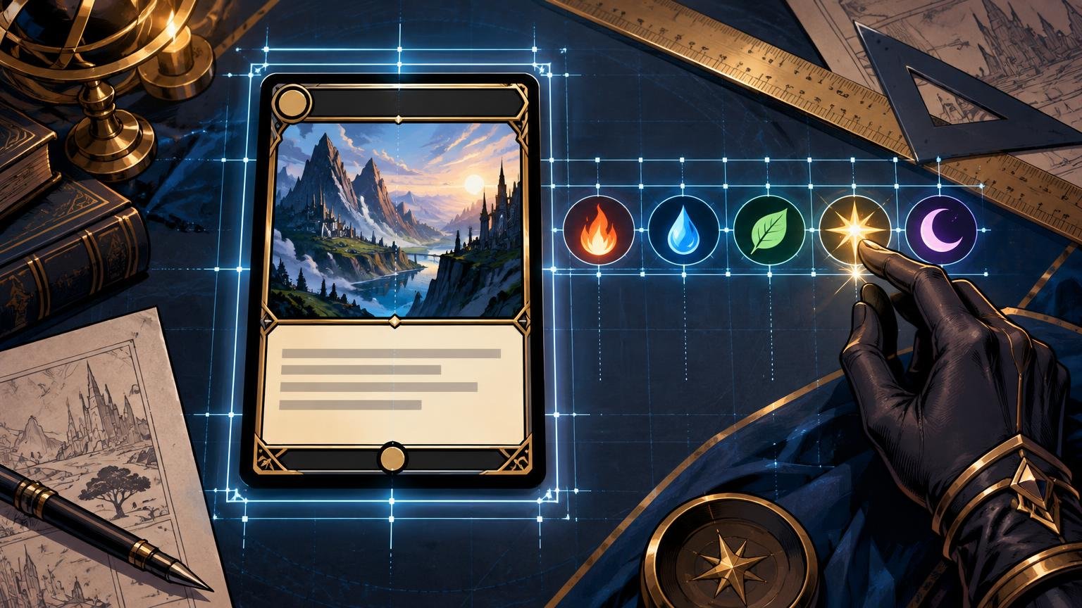
Start with a bare frame study: neutral panels, placeholder text and simple circles for symbols. Define the title zone, cost zone, artwork boundary, type line, rules box and lower information strip. Do not begin with gilded corners, smoky gradients or the dragon’s seventh decorative horn.
Choose one stable reference for each relationship. The title might align to the left edge of the rules text. The mana cluster might anchor to a fixed outer frame edge. The type line and body copy might share an inset. Credits and collector details can sit on one quiet baseline even when they align to opposite sides.
In Illustrator, objects can be aligned to a selection, a key object or the artboard, with exact spacing used for distribution. A frame component makes a better key object than a temporary piece of artwork because the frame remains constant across the set. Adobe’s object alignment and distribution documentation explains these reference modes.
This is also the moment to decide whether the whole project shares one visual grammar. A deck or Cube can vary its art dramatically while retaining the same title inset, icon scale and text rhythm. For a larger set, the method used to mix fantasy art styles without visual chaos can help separate deliberate variation from accidental inconsistency.
How to align mana symbols, icons and typography
Mana symbols should behave as one cost cluster, not as unrelated buttons. Give the cluster a stable outer anchor and consistent internal gaps. When the cost grows, let it expand in one planned direction rather than creeping unpredictably into the name.
Vertically, align the cluster to the title’s visual band rather than forcing every circle onto the text baseline. A practical starting point is to center its perceived weight against the title’s cap-height area. Then inspect it optically. A symbol with a dark lower mark may appear to sag even when its bounding box is perfectly centered.
The same principle applies to irregular identity icons, loyalty-like marks and inline rules symbols. Geometric alignment measures the object’s box; optical alignment judges where the visible shape seems to sit. A pointed icon may need a slight offset because its empty corners enlarge the box without adding visible weight.
Illustrator offers text alignment based on glyph bounds and snapping references that include baselines, x-height and glyph bounds. These controls are useful starting points, but the final decision still belongs to the eye at intended size.
For an icon embedded in rules text, size it in relation to the lowercase letters around it, then adjust its baseline position only as much as needed. Illustrator’s baseline shift can move selected characters relative to surrounding text. Use that correction consistently through a character style or documented rule rather than nudging every occurrence differently.
Set padding, leading and contrast as a system
Rules text feels polished when the box has calm edges. Establish its inset before choosing the final type size. Area type in Illustrator supports inset spacing and first-baseline controls, which can create repeatable padding and a stable first line across cards.
Next, set leading—the distance from one baseline to the next—deliberately. Illustrator’s automatic leading defaults to 120% of the type size, but that is a software starting point, not an art-direction decision. Dense rules may need a carefully tuned style, while flavor text may benefit from a clearer break.
Do not solve every readability problem with an outline, glow or heavy shadow. First calm the area behind the text. Darken or soften a strip of artwork, reduce local texture, or use a restrained translucent or opaque panel. A quiet value field usually looks more intentional than letters wrapped in a luminous fog bank.
Check contrast in grayscale as well as color. If the type survives only because it is blue against red, similar luminance can still make the boundary vibrate or disappear at small size. The title, cost and rules content should remain separable when color becomes less informative.
Handle long names without crushing the lettering
A long title colliding with a crowded cost is a frame stress test, not permission to squeeze the text until every letter resembles a narrow dungeon door. Use a fixed fallback order:
- Apply a modest, predefined tracking adjustment.
- Move to a properly designed narrower width or related face within the chosen family.
- Use a limited title-size reduction defined for the whole project.
- Use a tested two-line or subtitle treatment only if the frame was designed to support it.
- Rewrite an original custom title when its exact wording is not mechanically required.
Avoid horizontally scaling a normal typeface merely to force it into the zone. Adobe recommends choosing a properly designed condensed or expanded face instead of distorting text width or height. Purpose-built widths retain more coherent strokes, counters and spacing.
Protect a minimum gap between the final title character and the mana cluster. That breathing room matters more than preserving the largest possible title size. The reader should perceive two organized groups, not one continuous necklace of letters and circles.
Solve dense rules boxes in the right order
When a rules box overflows, edit the copy before making the type painfully small. Remove redundant phrasing from original custom mechanics, verify that line breaks are not wasting space, and move optional story material out of the mechanical paragraph. If the card is intended to represent existing game text, preserve the required meaning rather than casually rewriting rules language.
After copy editing, adjust paragraph spacing and leading within your established safe range. Reduce body size only as a controlled final step. The symbol-to-text relationship should remain stable: an inline icon that looked balanced at the standard size should not become a boulder among suddenly tiny letters.
Build one deliberately difficult test card containing a long name, crowded cost, dense rules, flavor text, credit and collector line. A frame that survives this card will handle ordinary designs more gracefully. A sparse showcase card can conceal weak spacing rules.
The comprehensive rules distinguish several categories of mana symbols, including colored, generic, colorless, hybrid, Phyrexian and snow forms. If your system needs to accommodate varied symbol types, include the widest and most visually complex combinations in the stress test rather than testing only a neat row of identical circles.
Coordinate the artwork with the text zones
Artwork and typography should negotiate before the crop is final. Look for a face, weapon, horizon, spell flare or high-frequency texture entering the title and rules zones. These elements pull attention even when they are partially covered.
I would preserve the character’s face and primary gesture, then simplify the less important area behind the interface. Move the crop, lower the contrast of a distant tower, soften sparks near the title or extend a calm patch of sky. Do not dim the entire illustration when only one troublesome corner needs restraint.
Coordinate frame light with the picture’s dominant light direction. If a spell glows from the lower left, a gentle echo of that warmth in nearby frame accents can unite the image. Keep that echo subordinate; every beveled edge does not need to catch supernatural fire.
When building a complete alternate-art concept, establish these interface constraints alongside the illustration rather than after it. The broader custom MTG proxy design process begins with the same principle: art, frame and readability must operate as one design.
Keep credits and collector information quiet but orderly
Credits, set marks and collector details deserve care without demanding attention. Place them on a consistent lower-strip baseline, use stable side insets and keep their contrast sufficient for deliberate reading. Their job is not to compete with the title during a glance across the table.
Test short and long credits, narrow and wide collector strings, and any required legal or project information. If these details wrap unpredictably, the lower strip needs a fallback rule just as much as the title zone does.
Evaluate the card at physical size
Zoomed-in inspection is excellent for finding rough masks and uneven curves. It is terrible for deciding whether a rules box is comfortable to read. Export the card at its intended dimensions and inspect it at 100% physical size.
When printing a PDF proof through Acrobat, choose Actual Size when you need an unscaled result. The Fit option can scale a page to the printer’s printable area, which undermines a true-size typography check.
Use at least two proof cards: the dense stress-test card and a low-contrast illustration with activity near the interface. Hold them at a normal handling distance. Ask whether the title and cost separate immediately, whether body text can be read without hunting for the first line, and whether the artwork still has a clear focal point.
- Squint: do title, cost, art focal point and rules panel remain distinct masses?
- Read the name and cost in one glance: do the groups collide?
- Scan the rules box: is the first line easy to find, and does each paragraph have rhythm?
- Check every inline icon: does it sit with the text rather than above or below it?
- Inspect the lower strip: is it orderly without becoming a second title bar?
- Compare several cards side by side: do shared elements remain fixed?
Freeze reusable frame and type rules
Once the proofs work, record the decisions as design tokens: title inset and baseline, mana anchor and gap, icon centerline, art safe zones, rules-box inset, body style, paragraph spacing and lower-strip baseline. Add defined fallback styles for long names and dense rules.
Record the font source and retain its license materials with the project. Do not assume that “free” means unrestricted. For example, SIL states that fonts under its Open Font License may be used in electronic and print works subject to that license’s requirements, and that embedding such a font does not change the license of the resulting document or graphic. Check the actual license supplied with the font you use.
The final decision
If the title, mana cluster, rules text and artwork focal point cannot each occupy a clear zone at true size, rebuild the zones before adding effects. Anchor the outer edges, correct symbols optically, protect the text insets and prove the result on the most difficult card in the set. Once that card reads cleanly, the frame will feel less like assembled decoration and more like a confident visual system.
References
- Anatomy of a Magic Card | MAGIC: THE GATHERING
- Align and distribute objects in Illustrator | Illustrator
- Align text in Illustrator | Illustrator
- Line and character spacing in Illustrator | Illustrator
- Add margins to text in Illustrator | Illustrator
- Transform text in Illustrator | Illustrator
- Magic: The Gathering Comprehensive Rules
- Adjust page size for printing PDFs in Acrobat | Adobe Acrobat
- Font FAQ – SIL Language Technology