
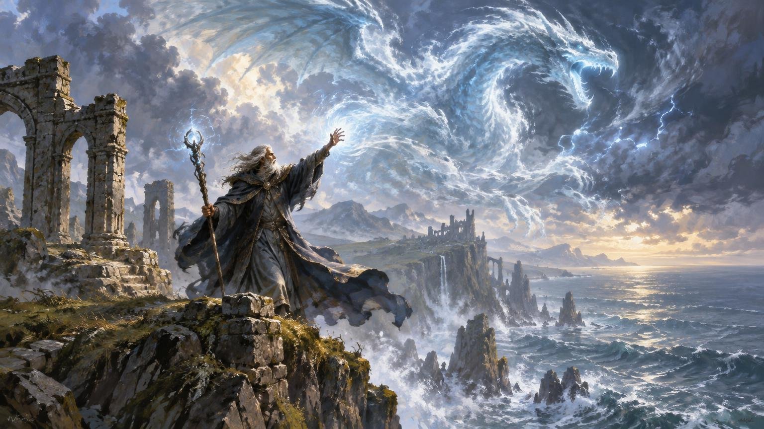
TLDR: An alternate art legendary creature visual story should communicate one defining action, choice or consequence—not squeeze an entire biography into the art window. Write the story as one sentence, turn its main verb into a readable pose, reserve the strongest contrast for that action and test the composition inside the intended frame from the beginning. If the creature, conflict and focal light do not register within two seconds at card size, simplify before rendering further.
The crown can be exquisite, the storm can have seven colors and every scale can carry a tiny rune, but none of that matters if the card first reads as “person standing in weather.” Building an alternate art legendary creature visual story means deciding what this character is doing that no ordinary creature would do—and making that idea survive a small crop, a frame and the visual noise of the table.
Define the visual job before drawing the legend
Start with a focal-story sentence containing a subject, an active verb and a consequence. “The frost queen seals the last living flame” is useful. “A powerful frost queen with an elaborate history” is not. The first sentence gives you hands, opposing temperatures, a vulnerable object and a moment of irreversible choice. The second gives you a costume-design assignment wearing a storytelling hat.
That sentence is not flavor text. It is an art-direction filter. Every major element should either establish the creature, clarify the action or show its consequence. A distant army might prove authority. A broken oath-ring might explain betrayal. Five unrelated relics placed around the border merely ask the viewer to perform archaeology during a game.
For more initial directions involving Commander identities, custom MTG proxy art ideas for Commander decks can help generate motifs. Once you choose one, however, reduce it to a single visible beat.
- Creature: Who owns the moment?
- Conflict: What is being attempted, resisted, protected or destroyed?
- Consequence: What changes if the action succeeds?
- Symbol: Which one object or environmental detail makes the story specific?
Use those four answers to write a compact art brief. For example: “An exiled sun-priest tears the halo from his own armor while dawn reaches the city behind him.” The creature owns the foreground, the torn halo carries the action and the distant dawn supplies the consequence. You already know what deserves the brightest edge.
Turn the dramatic verb into silhouette and gesture
A legendary silhouette should be identifiable before jewelry, facial markings or surface texture appear. Fill the figure with a single dark value and inspect the outer contour. Can you distinguish head, torso, primary action and signature prop? If the priest’s hand overlaps his chest, the torn halo may disappear into one dark knot. Move the arm into open space and tilt the halo so its broken circle reads immediately.
The pose should express the verb rather than merely display the costume. “Defies” pushes the chest and chin against an opposing force. “Guards” places the body between danger and a vulnerable element. “Summons” creates a directional relationship between hand, gaze and effect. “Judges” may use stillness, elevation and converging gazes from secondary figures. A calm pose can feel legendary, but it still needs a clear power relationship.
The face does not have to sit in the center. Centering can create icon-like authority, while an off-center face leaves room for a weapon arc, spell or opposing figure. What matters is that gaze, gesture and environmental movement cooperate. If the creature looks left while the spell, cape and light all pull right, the image may feel accidentally divided.
Add only one or two scale cues. A tiny rider beneath a colossal antlered guardian immediately creates size. A staircase ending near a seated necromancer establishes status. These cues must remain simple enough to read after reduction; a village of meticulously rendered peasants may become a decorative gray rash.
Build an alternate art visual hierarchy
Organize the image into three levels: the primary creature and action, a secondary element that explains the action, and tertiary texture that creates atmosphere. Value, color, edge sharpness and detail should all reinforce that order.
Localized contrast is especially valuable. Research on attention in natural scenes found that increasing a target’s contrast against its background increased rapid detection and fixation probability. That does not turn contrast into a recipe for good art, but it supports a practical choice: place your clearest light-dark separation around the story-bearing face, hand, weapon or object rather than scattering it evenly across the painting.
Meaning matters alongside contrast. Scene-viewing research indicates that semantic meaning can guide attention even when it is irrelevant to the viewer’s assigned task. A broken crown, threatened child or blade held at a companion’s throat can attract interest because it explains the scene, not merely because it is bright.
Use a simple value plan before color. Try three broad groups: a dark creature mass, a middle-value environment and a light focal event. Then decide where exceptions earn their place. The priest’s face might remain partly dark while the torn halo burns against it. That gives the choice more importance than the portrait.
Color should separate roles rather than decorate every surface. A restrained blue-gray world with one amber flame makes the flame narratively precious. If amber also appears in every window, buckle and cloud, that relationship weakens. I would lose those background accents and let the rare warm note carry the story.
Compose from the card crop backward
A full-screen painting and a card illustration are different compositions. The card frame removes space, changes proportions and places graphic elements near the art. An older Wizards design discussion described the frame as directing attention toward the art area; although it is historical context rather than a current template, the basic design lesson remains useful: frame and image are experienced together.
Choose the intended frame before polishing. A conventional art window may favor a compact action, while a borderless treatment can accommodate a larger environmental sweep. Keep the frame on a live overlay and paint beyond the crop. Photoshop’s Crop tool supports fixed dimensions or aspect ratios, and cropped pixels can remain available for later repositioning when they are not deleted.
Compare three rough crops before committing:
- Face and authority: A tighter portrait emphasizes identity, expression and status but may weaken the action.
- Action and conflict: A medium crop prioritizes hands, weapons, spells and opponents. This is often the strongest narrative option.
- World and scale: A wider crop makes architecture, armies or landscape meaningful but risks shrinking the legend into a costume-shaped punctuation mark.
Watch for frame tangencies: a horn barely touching the art-window edge, a sword aligned with the name bar or a face pinched between two graphic boundaries. Either create clear separation or make the overlap decisive. Near-misses look accidental.
Control detail before it turns into visual static
Fantasy art becomes muddy at card size when every material receives equal description. Chain links, rain, masonry, feathers, sparks and embroidered cloth may each look splendid at 100 percent zoom. Reduced together, they form competing frequencies with no quiet area around the story.
Group distant values, merge repeated shapes and reserve sharp edges for the focal action. Suggest an army with a few rhythmic spear shapes and one mass of banners. Describe a jeweled cloak with two or three strategic flashes instead of outlining every stone. Let atmospheric depth soften the background rather than outlining it harder to “save” the detail.
Simply shrinking a crowded image is not a reliable cure. One study found that perceived clutter remained invariant across the retinal image sizes it tested, supporting the limited but useful warning that reduction alone may not make a busy composition feel calmer.
Use three quick diagnostic views: a grayscale version to expose weak value grouping, a slight blur to reveal the dominant masses and a small thumbnail to test the first read. If the wrong object survives the blur, the hierarchy needs editing—not another glow behind the creature’s head.
Test the art against the frame and text overlays
Place the illustration in a complete mockup before final rendering. Keep the art as editable placed content so crop and source revisions remain possible; Adobe documents Smart Objects as a way to preserve and edit placed source content within a Photoshop composition.
Inspect the name area, art-window boundaries, type line, rules box and any ornamental frame elements. The frame may cover a fingertip that completes a gesture, turn a staff into an unexplained vertical line or hide the victim that makes an attack intelligible. Repair those conflicts by shifting the crop, simplifying a secondary shape or moving the action—not by reflexively adding brightness everywhere.
This is also where card-wide readability joins art direction. Designing a better MTG proxy card requires the illustration, frame and information hierarchy to cooperate. Your painting should provide energy without making the name and rules areas fight a dragon-shaped thunderstorm.
Review at thumbnail and physical-card size
At thumbnail size, ask three questions: Can I identify the creature class or defining silhouette? Can I read the main gesture? Does the focal light land on the story rather than the scenery? Do not judge embroidery, eyelashes or tiny runes here. Judge the image’s sentence.
At physical-card size, inspect subtler failures: adjacent dark values merging, small facial features becoming dirty marks, thin magical effects disappearing and secondary figures losing their narrative role. View the card upright on a table as well as close to your face. A piece can succeed as a portfolio image yet become indecisive at normal play distance.
Run a two-second test with the complete frame visible. Hide the image, reveal it briefly and then answer: Who is acting? What are they doing? Where is the focal light? If you can name only the creature type and color palette, return to silhouette and hierarchy.
Prepare the final artwork handoff
Keep the handoff subordinate to the art rather than redesigning the image around speculative production settings. Preserve a layered master, the selected crop mockup, a flattened art-only export, a complete card-face proof and a short note identifying the intended focal point and acceptable crop range. If the artwork will move into a larger deck or Cube workflow, review common MTG proxy design mistakes before locking the whole set.
Obtain the chosen printer’s current requirements before exporting production files. For example, PrintMTG currently specifies a 2.5 by 3.5-inch finished card, 0.125-inch or 3 mm bleed guidance and 300 dpi at final size. Those are printer-specific requirements, not universal settings for every destination.
Keep rights documentation with the project. Use artwork you created or have permission to use under terms that cover the intended alteration, printing and distribution. Wizards’ Fan Content Policy identifies its artwork, characters and other materials as intellectual property, requires respect for third-party rights and explicitly says its definition of fan content does not include counterfeit or proxy Magic cards. Do not treat that policy as permission to copy, repaint or print official card art.
Make the story pass before adding polish
Your final decision rule is simple: the creature, conflict and focal light must read quickly inside the intended frame. If one fails, return to the focal sentence, enlarge or separate the gesture, quiet the tertiary detail and test again at physical-card size. Render the gemstones only after the legend has done something worth remembering.
References
- Attention in natural scenes: contrast affects rapid visual processing and fixations alike – PMC
- Meaning Guides Attention During Scene Viewing Even When It Is Irrelevant – PMC
- Frames of Reference | MAGIC: THE GATHERING
- Crop tool options in Photoshop | Photoshop
- Clutter perception is invariant to image size.
- Create embedded Smart Objects in Photoshop | Photoshop
- PrintMTG
- Fan Content Policy | Wizards of the Coast