
TLDR
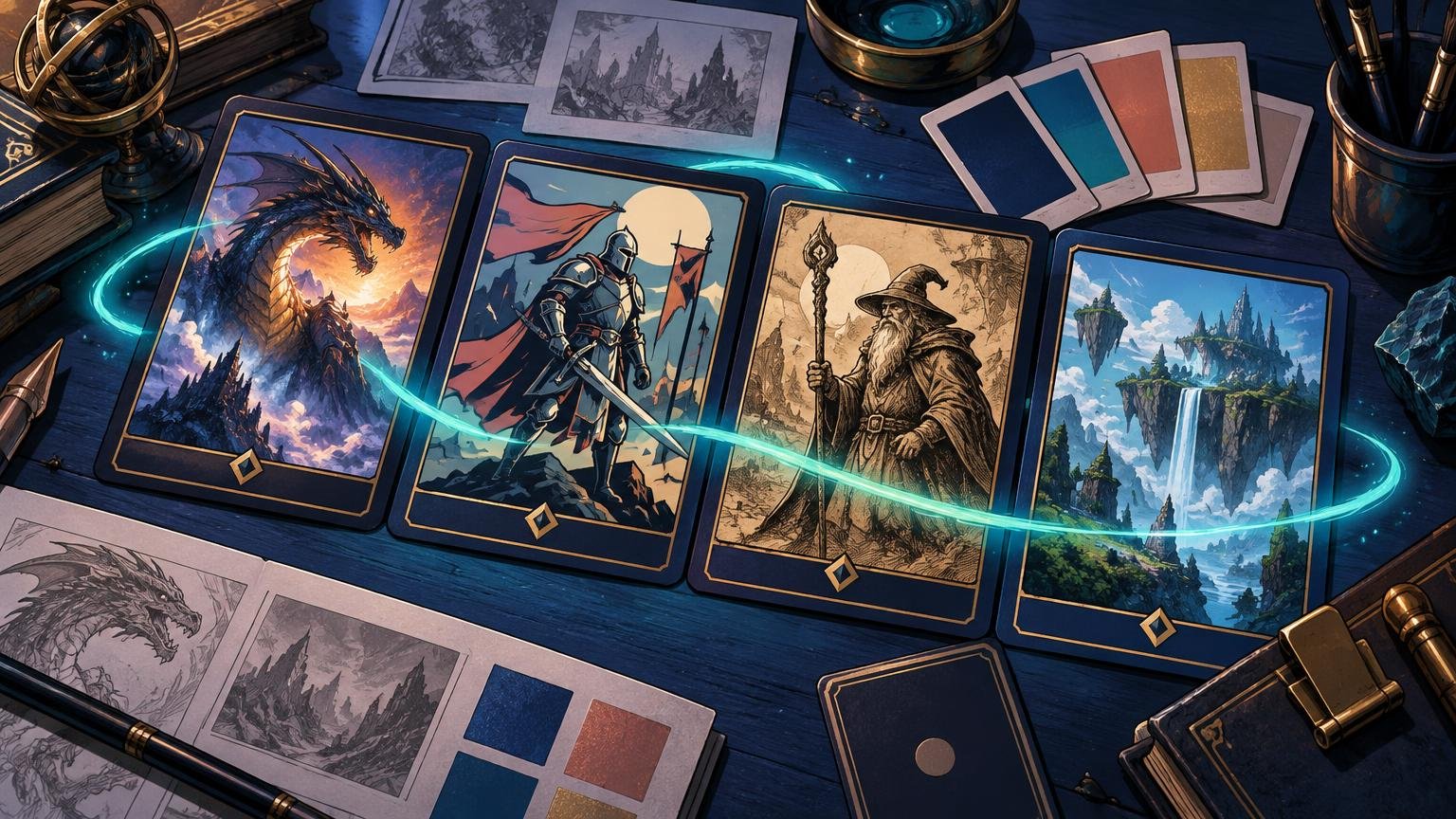
If you searched “mix art styles custom MTG Cube,” the short answer is this: do not force every illustration into one rendering style. Instead, repeat a smaller set of decisions across the Cube—palette temperature, value structure, lighting, focal scale, compositional rhythm and frame treatment. Allow a few deliberate exceptions for legends and finishers, then audit the whole environment as thumbnails and as physical groups. Consistency is not sameness; it is evidence that somebody made the decisions on purpose.
A painterly knight can sit beside a graphic necromancer and a finely rendered dragon without starting an aesthetic tavern brawl. The images simply need shared visual gravity. Perhaps their backgrounds remain subdued, their brightest accents mark game-relevant action, and their figures occupy similar amounts of the image. Those recurring choices will bind the Cube more effectively than applying one filter to everything.
Write a visual constitution before choosing more art
Cube is already an authored environment: its creator chooses themes, strategies, power level and rules, and the construction process is naturally iterative, as Wizards explains in its official Cube-building guidance. Apply the same thinking to art direction. Before collecting hundreds of attractive images, write a one-page visual constitution that defines what belongs in your world.
Start with three atmosphere words. “Ancient, rain-soaked, luminous” gives you more useful direction than “epic fantasy.” It suggests weathered surfaces, cool ambient light and small warm or magical accents. “Ceremonial, geometric, sun-baked” implies something entirely different: hard-edged shadows, repeated motifs and restrained earth colors.
Then define five parts of the system:
- World temperature: Decide whether the Cube generally feels cold, warm or balanced. Individual colors may depart from that baseline, but they should react to the same atmospheric world.
- Value range: Choose whether most scenes use deep theatrical contrast, misty compressed values or clear midtone staging. Value means relative lightness and darkness; it is what remains when color is mentally removed.
- Material language: Decide whether surfaces feel brushed, engraved, inked, softly modeled, cel-shaded or sharply digital. Multiple styles can coexist, but one or two material qualities should recur.
- Compositional rhythm: Set expectations for camera distance, subject scale and empty space. A Cube dominated by intimate portraits will struggle to absorb random panoramic battle scenes unless those panoramas have a defined role.
- Exception rule: Name the cards allowed to become louder. Multicolor legends, build-arounds and major finishers are sensible candidates because a visual interruption can reinforce their gameplay importance.
Also record exclusions. You might reject photorealistic faces, modern machinery, candy-bright backgrounds or compositions whose central action disappears at card size. Exclusions prevent an individually spectacular image from quietly rewriting the whole project.
Give each card group a role, not a rigid uniform
Color identity should influence the art without reducing every card to literal hue matching. A blue card does not need to be blue from corner to corner. It can belong through cool shadow behavior, reflective materials, distant depth or controlled light. Green might favor organic silhouettes and filtered illumination, while red uses closer action and harder warm accents. The shared constitution remains underneath those local choices.
| Card group | Useful visual rule | What to avoid |
|---|---|---|
| Creatures | Keep silhouettes readable and use a consistent range of camera distances within each creature class or faction. | A procession of unrelated portraits, panoramas and cropped body parts with no hierarchy. |
| Instants and sorceries | Show one clear action, source of energy or moment of transformation. Let the brightest contrast identify the spell. | Diffuse magical fog covering every corner without revealing what happened. |
| Artifacts | Repeat a material family such as aged brass, black iron, bone or glass, even when rendering styles change. | Every artifact introducing a new civilization, surface finish and era. |
| Enchantments | Use atmosphere, pattern and symbolic staging to separate persistent magic from momentary spell action. | Treating an enchantment as another explosion simply because the effect is powerful. |
| Lands | Establish the world's geography, weather and horizon behavior. Let land cycles repeat motifs rather than identical compositions. | Beautiful landscapes that appear to come from five unrelated planets. |
| Legends and finishers | Permit stronger contrast, closer framing, unusual borders or richer detail as a controlled exception. | Making every rare-looking card equally extravagant until nothing feels exceptional. |
For a legendary focal card, build its exception around a specific narrative moment rather than generic grandeur. The same method used to art-direct alternate art around a legendary creature’s story can help a Cube’s standout cards feel important without becoming disconnected.
Use an anchor family, a supporting family and an accent family
When several rendering styles are involved, classify them by function. The anchor family carries the Cube’s normal visual language. It might be atmospheric oil-like painting with softened edges and restrained backgrounds. The supporting family can differ noticeably—perhaps graphic ink work—but should preserve the anchor family’s value range, palette temperature or subject scale.
The accent family is the dangerous and delightful one: illuminated-manuscript dragons, woodcuts, stained-glass figures or highly stylized comic panels. Reserve it for cards whose gameplay role justifies a visual trumpet blast. If accents appear without hierarchy, they stop being accents and become noise.
This is a qualitative model, not a mandatory numerical ratio. A graveyard Cube could support more ink and etching than a high-fantasy battle Cube. Judge each family by whether it carries a recognizable job. The useful question is not “Do these paintings look alike?” but “What repeated decision makes them inhabitants of the same world?”
If comic-inspired work forms one of your families, define its line weight, panel energy and color behavior instead of treating “comic” as a single style. The process in this guide to art-directing a comic-style alternate-art deck transfers well to Cube-wide visual grammar.
Coordinate lands, tokens and frames from the beginning
Basic lands are not background administration. Players see them repeatedly, often in clusters, so they become the Cube’s visual breathing rhythm. Use them to establish climate, architecture and distance. A land suite can move from dawn to dusk or coast to mountain while retaining the same clouds, horizon height, border treatment or recurring accent color.
Nonbasic lands should bridge environments rather than look like postcards imported at random. A fixing land could combine the materials or weather associated with the colors it supports. That is subtler—and usually richer—than splitting the image into two obvious color zones.
Plan tokens and emblems as a suite too. Official Magic previews show how varied token and emblem categories can become across a card environment. Give yours common portrait scale, backgrounds, icon placement or edge treatment. Tokens are handled beside the main cards during play; an unplanned token can break the illusion as quickly as an outlier creature.
Keep image cohesion and frame cohesion separate. Wizards distinguishes alternate artwork from special-frame treatments in its product terminology, and that distinction is useful for art direction. Two illustrations may belong together while their frames fight. Conversely, a uniform frame cannot rescue incompatible lighting, genre or focal scale.
Audit double-faced cards, showcase-like treatments and borderless pieces in both states. If a special frame is part of the hierarchy, assign it a role. If it appears merely because it looked exciting in isolation, it may be the actual source of visual chaos.
Build a contact sheet before finalizing individual cards
A Cube cannot be art-directed one full-screen illustration at a time. Build a contact sheet containing every card image in the same card-shaped proportion. The previews do not need to be large. In fact, small previews expose whether silhouettes, value masses and focal points survive realistic viewing better than enlarged artwork does.
- Sort the first sheet by color identity and card type. This reveals whether one section is unusually dark, glossy, crowded or distant.
- Build a second sheet grouped by visual family rather than gameplay category. This exposes an accent style that has spread too widely or an anchor family that is too weak to anchor anything.
- Reduce the sheet until individual details disappear. Look for the brightest cards, darkest cards and largest faces. These will dominate the Cube whether you intended them to or not.
- Inspect every image at approximate card size with the intended crop and frame. Artwork that succeeds as a large painting may become indecipherable after the title bar and rules area take their share.
- Create a tabletop view with overlapping rows. This approximates how several cards compete for attention during a draft or game.
When an image must be enlarged for the final file, preserve its texture rather than smoothing it into polished wax. A reversible workflow for upscaling fantasy art without losing natural texture is especially useful when older or painterly images need to coexist with crisp modern work.
Find the card that entered from another project
Outliers are easier to fix when you label the reason instead of declaring that something “doesn’t fit.” Give each questionable card one or more practical flags: too bright, too dark, too glossy, too flat, wrong camera distance, wrong genre signal, unclear silhouette, excessive background detail or frame clash.
Then change the smallest variable that solves the problem. A glossy digital painting may only need restrained highlights, quieter saturation and a little texture in its shadows. A remote battle scene may need a tighter crop. A wonderful beast disappearing into the background may need a cleaner value separation between its silhouette and the sky.
I would be especially suspicious of bright background details near a small subject. At card size, the eye follows contrast before lore. If a moonlit tower shines more brightly than the dragon attacking it, you have accidentally made a tower card with decorative dragon furniture.
Not every outlier should be repaired. Some images are simply from the wrong visual world. Keep a rejection folder so an excellent illustration can wait for a Cube that actually deserves it.
Test small physical groups under play conditions
Print or preview a representative group of roughly 9 to 15 cards at physical size. Include a basic land, a nonbasic land, a token, a creature, a spell and at least one intended exception. Sleeve them if sleeves are part of the final presentation, then inspect the group under the lighting where the Cube will usually be played.
Ask one direct question: which card looks as if it entered from another project? Diagnose whether the cause is artwork, crop, frame, finish or reproduction. Do not automatically repaint an image when a bright frame or inconsistent border is creating the disruption.
Run the same check for readability. Can you identify the focal subject at arm’s length? Do dark cards collapse into nearly black rectangles? Does the spell effect remain distinct from its background? If the physical group loses texture or separation, revisit the source files before committing the whole Cube. When approved artwork is ready to become physical cards, custom MTG printing is a possible next step, but file preparation should follow the chosen provider’s current requirements.
Keep a one-page update log
A coherent Cube can drift as cards are replaced. Preserve the system with a compact log containing the card’s role, visual family, palette fit, frame treatment, exception status and the reason its artwork was selected. Add the constitution’s atmosphere words and exclusions at the top.
This record does not need to become a bureaucratic grimoire. Its purpose is to make future choices faster. When a new card enters, you can decide whether it reinforces an existing family, fills a deliberate gap or asks for an exception. If it does none of those things, its beauty is not enough.
A brief note on artwork rights and play use
Verify permission for every commissioned, licensed or third-party image according to the actual rights holder’s terms. Credit is not automatically permission. Wizards’ Fan Content Policy describes terms for unofficial fan content but explicitly does not function as permission for creating counterfeit or proxy Magic cards, so do not stretch it beyond its stated scope.
Label unofficial custom pieces accurately and agree on their use with your playgroup or event organizer. Wizards’ published policy states that sanctioned-event cards must be authentic Magic cards, apart from a narrow judge-issued replacement exception for damaged cards. Pixelteca’s MTG proxy use policy provides additional site context, but it does not replace the rules of a particular event.
Make the whole Cube pass one final view
Before commissioning, finalizing or printing anything, assemble the complete contact sheet. Keep an image only if it serves the written constitution at thumbnail size, inside its frame and beside neighboring cards. Let rendering styles vary boldly, but make palette behavior, light, scale and hierarchy answer to the same world.
That is the decisive test: the Cube should not look as though every card was painted by one hand. It should look as though many hands were invited into one carefully directed realm.