
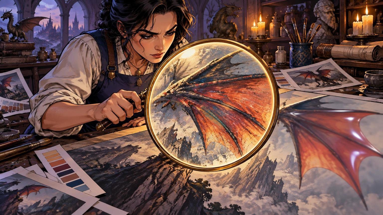
TLDR: If your goal is “upscale fantasy art for print natural texture,” enlarge only after fixing the crop, silhouettes, composite edges, values and color. Work reversibly, resize once to the printer’s required pixel dimensions, then apply denoising and sharpening as separate local treatments. Inspect technical defects at 100%, but make the final aesthetic decision at the physical size of the print.
A technically larger painting can become a visually smaller one. Mist turns into vinyl, skin becomes wax, scales acquire white halos, and every distant cloud suddenly demands the same attention as the dragon’s eye. The cure is not a stronger enhancement slider. It is to preserve the hierarchy already inside the artwork: crisp where the story needs emphasis, quiet where atmosphere needs room, and textured where the material should feel touched by a brush rather than wrapped in plastic.
What creates the plastic look?
The plastic look usually appears when several different editing jobs are collapsed into one global operation. Upscaling changes pixel dimensions. Denoising suppresses unwanted variation. Sharpening increases edge contrast. Color correction changes relationships between hues and values. Compositing cleanup repairs seams, fringes and mismatched elements. None of these can substitute for the others.
| Operation | What it should solve | Common failure |
|---|---|---|
| Resampling or upscaling | Reach the required pixel dimensions | Invented-looking micro-detail or repeated texture |
| Denoising | Reduce compression chatter, chroma speckles or unwanted noise | Waxy skin, polished stone and featureless clouds |
| Sharpening | Clarify selected edges at the output size | Halos, jagged contours and amplified noise |
| Color and value correction | Restore focus, depth and material separation | Flattened shadows or competing highlights |
| Composite cleanup | Repair masks, seams and inconsistent edges | Cutout figures, bright fringes and broken atmosphere |
Natural texture is not simply noise. Dry-brush marks may describe worn leather; soft grain can hold fog together; small hue variations can make skin or stone feel alive. Before removing texture, ask whether it is random damage or part of the material language. I would happily lose a magenta JPEG speckle in a knight’s cheek, but not the broken brush edge that makes the cloak feel weathered.
Start with the final print, not an enlargement percentage
Ask the production provider for the final image area, trim size, bleed, required effective resolution, accepted file format and color-profile instructions. Those requirements control the production file. Adobe describes pixel dimensions as the amount of image data and print resolution as the density at which those pixels are placed on the page. Changing resolution without resampling does not create more pixels; changing pixel dimensions does require resampling. Adobe’s printed-image resolution guide explains that distinction and notes that 300 PPI is generally appropriate for print unless the printer specifies otherwise.
Calculate the required dimensions with a simple formula: final inches multiplied by the printer-required PPI equals required pixels. If a provider requests a 3-by-4-inch image area at 300 PPI, for example, the illustrative target is 900 by 1,200 pixels. Include bleed in the calculation only as that provider instructs. Do not assume that every card, poster, art print or paper stock uses the same setup.
If you are still selecting a format or comparing broader print production options, settle that decision before committing to the upscale. A beautiful enlargement aimed at the wrong aspect ratio merely gives you more pixels to crop away.
Build a reversible working master
Duplicate the original and protect it from accidental overwriting. In Photoshop, place the source inside a Smart Object or retain an untouched base layer. Keep color adjustments, cleanup and sharpening on labeled layers rather than baking everything into one flattened image. Smart Objects preserve source content and can support editable Smart Filters.
Use adjustment layers and masks for local tonal and color changes. Photoshop masks use white to reveal, black to conceal and gray for partial transparency, which makes them useful for feathered light, fog and gradual corrections. Equivalent non-destructive tools in another capable editor are fine; the important feature is being able to revise the correction without damaging the source.
- Untouched source layer or linked original
- Crop and composition guides
- Composite-cleanup layers
- Masked value and color adjustments
- Resampled working version
- Separate denoise treatment
- Separate output-sharpening treatment
- Notes recording the target dimensions and printer instructions
Fix the picture before manufacturing pixels
Set the final crop before enlargement. The crop determines which details deserve protection and where the viewer will look first. A wider painting may depend on a distant moon and a spear tip for balance, while a narrow card window may amputate both. In that case, the problem is composition, not resolution.
Repair obvious seams, transparency fringes and silhouette collisions at this stage. Check hair against sky, wings against glow, weapon edges against bright mist and any pasted element against its new background. A pale matte fringe becomes more conspicuous after sharpening. A tangent between a horn and the frame remains awkward no matter how many pixels surround it.
For card art, place the crop inside the intended frame while making these decisions. The approach used to build alternate art around a legendary creature’s story is useful here: protect the defining action and silhouette instead of treating every ornament as equally important.
Correct local values and color before upscaling
A soft image is sometimes a hierarchy problem wearing a resolution costume. If the face, spell and background tower all share similar brightness, sharpening will only make three competing focal points more insistent.
Use restrained masked corrections. Darken the background behind a pale profile rather than outlining the entire head. Reduce the saturation of a distant red banner if it competes with the central flame. Cool the shadows around a warm spell so the magic reads without turning it radioactive. Lift a narrow rim light only where it clarifies a silhouette.
Keep masks broad enough to belong to the painting. An adjustment that stops abruptly around a figure creates a cardboard cutout. Follow the existing light direction, vary mask opacity across irregular surfaces and inspect transitions over both dark and light backgrounds. The goal is not to reveal every buckle on the adventurer. It is to make the adventurer readable before the buckles ask for attention.
Upscale fantasy art for print while keeping natural texture
Once crop, cleanup and major tonal relationships are stable, resize once to the required output dimensions. Photoshop defines resampling as adding or removing pixels and offers Preserve Details 2.0 as one enlargement option, including a Reduce Noise control. Treat it as a starting point, not a promise that missing brushwork has been recovered.
Compare the result with the protected original. Look separately at focal features, soft transitions and textured materials. Eyes, runes and selected armor edges may benefit from greater definition. Mist, magical bloom, distant architecture and painterly skin transitions should usually remain quieter. If every surface acquires the same granular detail, the result may be larger but less believable.
Avoid a chain of resize, flatten, export and resize again. Repeated transformations make it harder to identify where artifacts entered the file. Keep the resampled version inside the editable master and generate new derivatives from that controlled source.
Separate denoising from sharpening
Denoise only what is actually unwanted. Compressed source files may show block boundaries, ringing around edges, chroma speckles or crawling texture in smooth gradients. Mask the correction into those areas. Preserve deliberate paper tooth, brush drag, cloud grain, fur breakup and the irregular patina of metal.
Then sharpen for the intended output. Favor meaningful edges: the nearer eye, the edge of a blade crossing a soft background, the illuminated lip of a shield or the principal runes in a spell. Keep sharpening away from fog, glow cores, shallow-focus backgrounds and already noisy shadows.
Adobe recommends judging Smart Sharpen at 100% and increasing the effect gradually to avoid halos, jagged edges and amplified noise. Its documentation also warns that sharpening cannot restore genuinely missing detail. This is the moment to be suspicious of glorious dragon scales that did not exist five minutes ago.
Inspect defects at 100%, then judge the art at print size
At 100% zoom, patrol the image rather than admiring it. Check mask borders, pale fringes, dark sharpening rims, jagged diagonals, banding in skies, repeated-looking texture, broken gradients and abrupt changes between retouched and untouched areas. Toggle each treatment off and on. If an edit solves one defect but creates a louder one, reduce or remask it.
The 100% view is a technical inspection, not the final verdict. Zoom back to the intended physical size and place the art inside its real crop or card window. Ask whether the subject reads immediately, whether the brightest area supports the story, whether foreground and background separate, and whether texture still describes material instead of shouting “filter.” A card-sized illustration must survive among a frame, name line and rules area; designing the complete proxy card requires judging that whole visual system, not the art in isolation.
- Can you identify the subject and action at a glance?
- Does one focal area dominate without looking pasted on?
- Do mist, glow and distance remain softer than nearby hard materials?
- Are important silhouettes clear inside the final crop?
- Does any texture become a distracting pattern at physical size?
- Would one less sharpening pass improve the mood?
Soft-proof conditionally, not ceremonially
Soft proofing can preview the image through a chosen output profile, but it is only useful when you have an appropriate profile and a suitable viewing setup. Adobe notes that reliability depends on the monitor, monitor and output profiles, and ambient lighting; a profile for the exact printer-and-paper combination can provide a more accurate preview. ICC profiles describe the color behavior of devices and may account for the print medium, so paper can materially affect the appearance.
Use the provider’s supplied profile and conversion instructions when available. Do not convert to CMYK merely because the file will be printed, and do not assume a favorite export format is universally correct. Some providers want a particular RGB space; others specify a production CMYK workflow. Their current instructions decide.
Pay special attention to dark fantasy art on warm or uncoated paper. Deep blue shadows, muted purple cloth and near-black armor may compress toward one dark mass. A proof is most valuable when those relationships carry the scene. The aim is not to make every shadow bright; it is to keep the important shadow families distinguishable.
Know when the source is the real limitation
A tiny, heavily compressed source may not contain enough structure for a convincing large print. If faces are only a few uncertain blocks, upscaling cannot prove what the original features were. Before adding global detail, consider a tighter final size, a different crop, a better scan, access to the original layered file or deliberate repainting by an artist.
Different styles also demand different restraint. Cel-shaded work needs clean contours and stable color fields, not painterly grain poured over everything. Traditional scans may need paper texture balanced rather than erased. Smoke and glow tolerate softness but expose banding. Transparent composites demand careful edge cleanup. AI-assisted images may contain plausible-looking but inconsistent ornaments; enlargement can make those inconsistencies more visible, not more correct.
Confirm that you have permission to reproduce the artwork before preparing it for print. Upscaling, repainting or compositing an image does not by itself settle artwork-use rights.
Export a master and a production derivative
Keep one layered editable master containing the protected source, masks, adjustments and reversible filters. From it, create a separate production derivative at the exact dimensions, profile and format requested by the selected provider. Name the derivative with its dimensions or job specification so it cannot be confused with the master.
Before delivery, reopen the exported file. Confirm its pixel dimensions, crop, profile and visible edges. View it once at 100% for defects and once at intended print size for the actual experience. If the image reads clearly at final size and the 100% view reveals no distracting manufactured texture, stop editing. If it still needs “more detail” to communicate, reconsider the crop, value structure, source quality or final size before reaching for another global sharpening pass.
References
- Understand printed image resolution in Photoshop | Photoshop
- helpx.adobe.com
- helpx.adobe.com
- helpx.adobe.com
- helpx.adobe.com
- Use layer masks for targeted adjustments in Photoshop | Photoshop
- helpx.adobe.com
- Resampling options in Photoshop | Photoshop
- Sharpen images with Smart Sharpen in Photoshop | Photoshop
- Proofing colors in Photoshop | Photoshop
- CHAPTER 2
ICC Profile OverviewWhat is an ICC P