
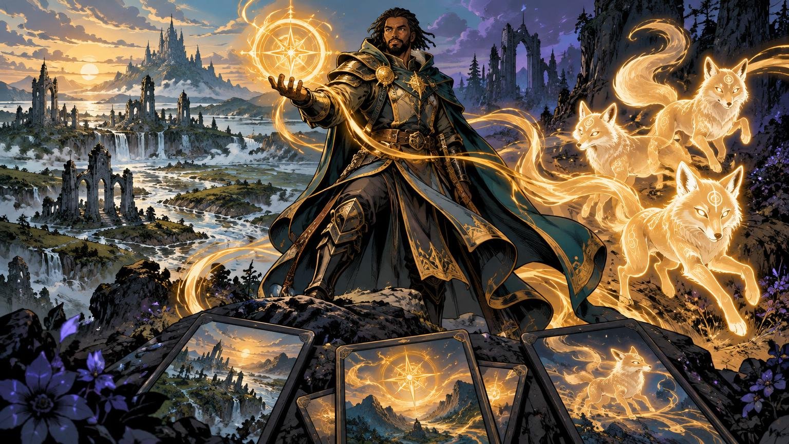
TLDR: Begin with one sentence describing the deck’s world, then fix a small set of rules for light, palette, materials and recurring shapes. Give the commander, lands, tokens and signature cards different visual jobs. Review everything as thumbnails and in realistic battlefield groups; reject any image that breaks the system without being an intentional exception.
A cohesive deck should look as though every card remembers the same weather. The commander might stand beneath a green eclipse, the lands may show its light touching distant ruins, and the tokens can carry fragments of that same sickly glow. The scenes do not need to match. Their visual logic does.
The best approach to matching lands tokens Commander artwork is therefore not to collect dozens of individually impressive pictures. It is to art-direct a small illustrated world. Commander’s singleton structure puts many different cards around one legendary focal character, making repeated visual ideas especially useful for holding the package together. Wizards’ introduction to Commander describes the format’s commander-led, 100-card structure and its color-identity and singleton constraints.
Build a system for matching lands tokens Commander artwork
Before choosing individual images, write a visual premise in one sentence. It should name a place, a mood and a source of tension. “A moonlit marsh kingdom slowly being reclaimed by luminous fungi” is useful. “Dark fantasy” is not; it leaves almost every decision unresolved.
Translate that premise into five rules. Keep them brief enough to sit beside your contact sheet:
- Setting: drowned masonry, reed beds and low wooden causeways.
- Light: cold moonlight from above, with green magic rising from below.
- Palette: blue-black shadows, gray stone and one controlled acid-green accent.
- Materials: wet wood, tarnished silver, translucent spores and rough linen.
- Composition: large dark silhouettes against open mist, with the brightest detail near the subject’s face or effect.
These are constants, not instructions to repaint the same swamp repeatedly. They create recognizable family traits while leaving room for forests, creatures, interiors and explosive spells. I would rather see five images share one convincing light rule than see five unrelated images forced through the same teal color filter.
Color identity can provide an initial boundary, but it is not a complete palette. A green-black deck might use cool green as magical light, warm ochre for mortal spaces and violet-gray for distance. Decide what each color does. Without those roles, every artist or image source may interpret “green-black” as a different mixture of emerald fog, brown mud and neon poison.
Give each card group a different visual job
Cohesion becomes easier when each group contributes something distinct. The commander should not look like a basic land with a person pasted into the middle, and every land should not perform like a movie poster. Assigning roles prevents the set from becoming either monotonous or noisy.
| Card group | Primary visual job | Useful treatment |
|---|---|---|
| Commander | Introduce the world and its central personality | Strong silhouette, clearest face or emblem, fullest palette |
| Basic lands | Establish geography and provide visual breathing room | Broader views, quieter contrast, recurring landmarks |
| Tokens | Show the deck’s cast, summons or created matter | Simple silhouettes, repeated materials, immediate type recognition |
| Signature spells and permanents | Mark major story beats | More dramatic light, closer action or a controlled frame variation |
| Utility cards | Support continuity without competing for attention | Reduced accents, simpler compositions and familiar environmental details |
Make the commander the visual anchor
The commander should contain the clearest version of the system. If silver branches, green fire and a broken moon define the deck, this is where all three can appear together. Give the figure a readable silhouette and reserve the strongest contrast for the face, weapon, familiar or magical effect that explains their identity.
Avoid making every related image imitate the commander’s pose. Repetition should happen through motifs and light, not through twenty centered figures staring grandly past the same shoulder. Even a magnificent dragon becomes tiresome when the entire deck attends the same portrait studio.
Let lands reveal the environment
Basic lands are the wide shots. Use them to show where the commander rules, travels or causes trouble. A Plains might reveal pale causeways crossing the marsh; an Island could open onto moonlit floodwater; a Forest might move beneath the fungal canopy. Repeating one distant tower or celestial shape across several land types can join them without turning them into copies.
A land cycle may also use structured variation. Wizards has published full-art basic lands in multiple seasonal variants across all five basic land types, demonstrating how one environmental concept can support systematic changes rather than one repeated scene. You can borrow the principle without copying the artwork: hold the world and composition logic steady while changing season, hour, weather or distance.
I prefer quieter lands when the commander and tokens are already elaborate. Open mist, large shadow shapes and restrained highlights give the eye somewhere to rest. Showcase lands can be dramatic, but if every mana source contains a portal, dragon, lightning strike and ruined cathedral, the battlefield loses hierarchy.
Make every token look created by something
A token should visibly belong to the card or engine that produces it. Repeat a material, edge shape, magical residue or lighting direction from the source. A spirit made by the moonlit commander might have tarnished-silver ornaments and green light beneath translucent skin. A Treasure token could use the same silverwork and fungal glow rather than becoming a generic heap of warm gold.
Recognition still comes first. Preserve a distinct silhouette for each token type and avoid burying a small creature in atmospheric effects. If the package includes many token designs, the workflow in making multiple token designs feel like one set can help establish shared rules without sacrificing type clarity.
Plan controlled variation instead of perfect uniformity
Choose three or four constants and allow everything else to vary. For example, keep the lighting direction, accent color, material language and horizon placement stable. Then vary camera distance, weather, subject scale and scene type. This gives the package rhythm: portrait, landscape, close action, quiet object, then another broad environment.
A useful variation plan might include roughly one dominant treatment for ordinary cards, a quieter treatment for lands and a more theatrical treatment for a handful of signature cards. The exact count matters less than the hierarchy. Players should be able to sense which images are landmarks before reading every title.
Frame treatments need the same restraint. Choose a base frame language, then define which cards may depart from it. The commander, a transformed state or one climactic spell can earn a borderless or unusually ornamented treatment. If half the deck receives a different special frame, the exception stops carrying meaning.
Multiple artists or printings can still coexist. Match them by broad visual properties rather than expecting identical brushwork: hard or soft edges, realistic or exaggerated anatomy, dense or open backgrounds, warm or cool shadows, and matte or luminous magic effects. A painterly landscape and a crisp character illustration can belong together if their light, atmosphere and materials agree.
Build a contact sheet before polishing individual cards
A contact sheet exposes problems that disappear while you admire one image at a time. Place the commander first, followed by lands, tokens, signature cards and representative utility cards. Start with art crops rather than complete card layouts so frames and text do not disguise a weak visual relationship.
If you are curating existing printings, catalog each candidate by artist, illustration, border, full-art treatment and frame effect. The documented Scryfall card data fields include artist information, illustration identifiers, image data, full-art status, border data and frame effects, all of which can support a reference sheet.
Review the sheet at three scales:
- Thumbnail scale: Look for dominant color blocks, repeated silhouettes and obvious stylistic intruders. If one card becomes a white flare or a muddy brown hole, mark it.
- Medium scale: Check lighting direction, background density, recurring materials and whether lands and tokens seem to occupy the commander’s world.
- Full-card scale: Add the intended frames and inspect focal points, value contrast and art cropping. Make sure the important action survives inside the art window.
Do not correct every mismatch by adding the same color overlay. First diagnose the cause. A warm image may need cooler shadows; a cluttered image may need background detail removed; a token may need a larger silhouette; an outlier may simply belong to a different visual genre. Global tinting often makes the palette more similar while leaving the actual art direction unresolved.
Audit the outliers deliberately
Circle the three cards that feel least related to the commander. For each one, identify the specific break rather than saying it “doesn’t match.” Common failures include:
- Temperature: one sunset-orange scene inside a predominantly moonlit package.
- Rendering: one glossy digital character among loose, textured paintings.
- Density: one image packed with tiny objects while the set relies on broad silhouettes.
- Genre: one comic or steampunk treatment inside an otherwise solemn folkloric world.
- Anatomy and shape language: sharp, mechanical creatures among rounded organic forms.
- Accent use: a supposedly rare magical color covering half the image.
- Frame treatment: an ornamental border appearing on a card with no special narrative role.
An outlier can remain if it has a clear purpose. A board wipe might turn the deck’s green underlight into stark white. A transformed commander might reverse the palette. Write down why the exception exists and repeat one familiar element—perhaps the same moon, material or silhouette—to keep the door open to the established world.
Test realistic battlefield groups
A full contact sheet is useful, but cards are rarely seen in one tidy grid during play. Build several small groups that mimic the combinations most likely to sit together:
- The commander beside three early lands.
- A token maker beside each token it creates.
- A fan of the basic-land variants.
- The commander, a signature permanent and a utility artifact.
- A crowded battlefield with several tokens and mixed card frames.
View each group at ordinary card size and from farther away than your editing screen. Ask which image claims attention first, whether token types remain distinguishable and whether any land overwhelms the commander. Then reduce or redirect contrast rather than merely shrinking details. Brightness, edge sharpness and color saturation usually control attention more strongly than intricate decoration.
If you are creating custom proxy or playtest-card files, keep visual review separate from permission and production decisions. Confirm that you have appropriate rights to use, alter or reproduce artwork, and check the expectations of the playgroup or event. Pixelteca’s MTG proxy use policy provides relevant context for personal creative projects. No visual system grants permission to use someone else’s work.
Only after the artwork and layouts survive these group tests should the project move toward physical output. If that is the next step, printing custom MTG cards is one possible route, but file and output requirements should be checked directly with the chosen provider before preparing final assets.
Record a small deck art bible
Finish with a one-page deck art bible so future additions do not restart the argument. Include the premise sentence, palette swatches with named roles, lighting direction, approved materials, recurring motifs, composition rules and allowed exceptions. Add one positive example and one rejected example for each major rule.
Also record what varies by card group. Note that lands use broad views and lower contrast, tokens use simplified silhouettes, the commander carries the full motif set, and signature cards may use the exceptional frame. This turns taste into a repeatable system rather than a memory of what looked good last month.
The final decision rule
Place a new image beside the commander, one representative land and its closest related token. If it follows the world premise, lighting rule, palette roles, material language and assigned card-group job, it belongs. If it breaks one of those rules, it must earn that break as a deliberate story moment. If you cannot explain the exception in one sentence, replace or revise the image.
That is the difference between matching and merely similar. A successful package does not make every card look identical. It makes every card feel as though it crossed the same border, breathed the same air and learned its magic under the same impossible moon.