
TLDR
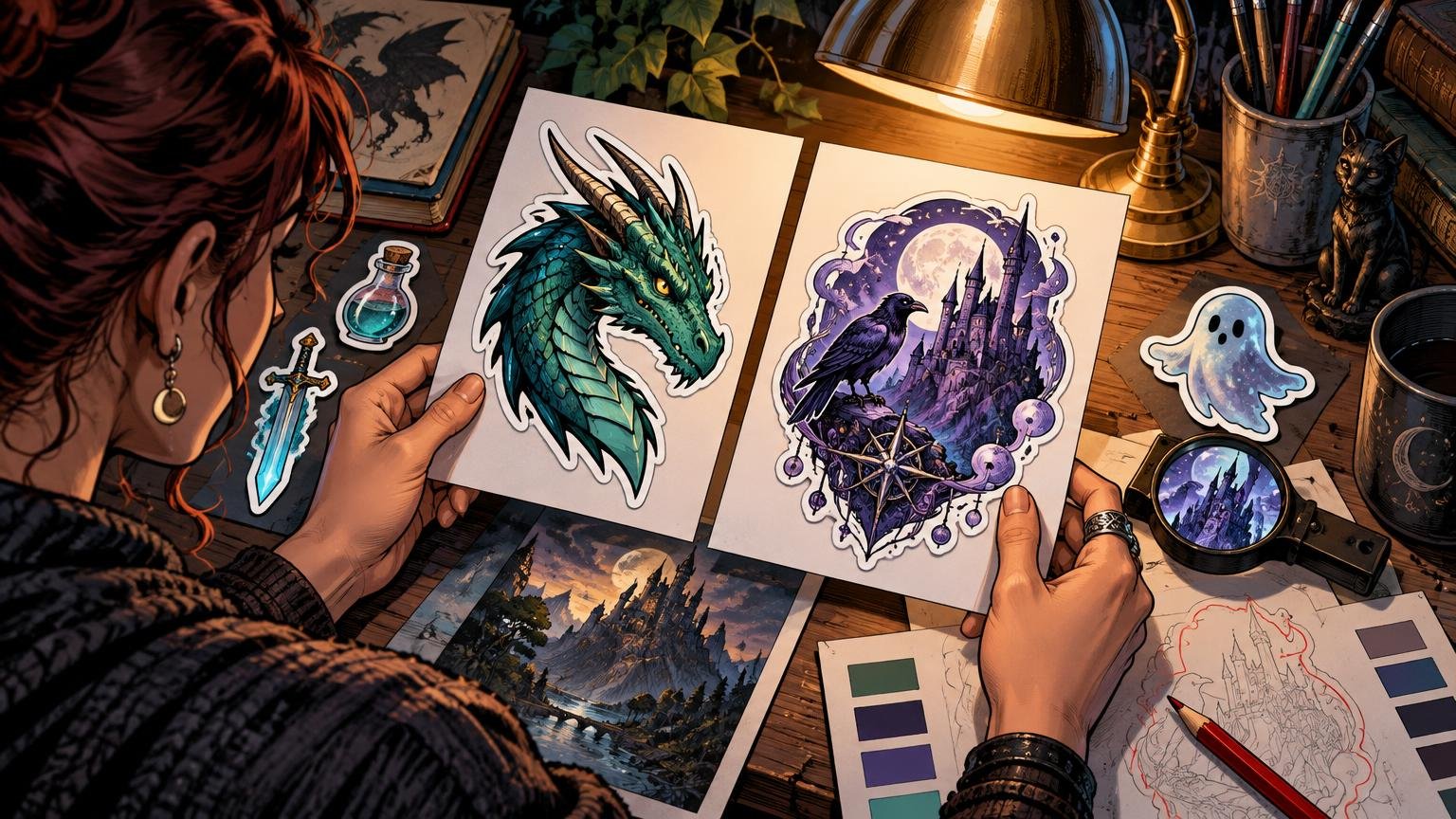
A luminous eye, sharp crest or unmistakable creature silhouette should register before anyone notices the tiny runes in its armor. For readers searching “CustomStickers vs Sticker Mule artists illustrators,” the useful answer is not a universal quality winner. CustomStickers.com is the more flexible documented option when you need a one-off low-quantity die-cut test or a choice between matte and gloss. Sticker Mule is the clearer fit when you want at least 10 copies of one design and value its stated four-day turnaround. For either vendor, judge the final proof—not the full-screen painting.
Choose by pricing the same final dimensions, shape, quantity and delivery conditions through both services. Then compare the proofed crop, cutline and total checkout cost. Published specifications can tell you how to prepare the file, but they do not establish which company will reproduce color or fine detail better in practice.
CustomStickers.com vs Sticker Mule for artists and illustrators
The meaningful differences begin with order structure, finish and proof behavior. Neither vendor’s displayed starting price is a fair value comparison on its own: size, shape, quantity, finish, shipping, tax, production speed and promotions can all change the final quotation.
| Decision point | CustomStickers.com | Sticker Mule |
|---|---|---|
| Small-order structure | Its standard custom-sticker configuration lists quantities beginning at 50, while its separate low-quantity die-cut product allows orders starting from one sticker. | Standard custom stickers are available from 10 per design. |
| Standard finish information | The company lists matte or gloss options on white vinyl with laminate. Transparent artwork areas show the white material rather than becoming clear. | The company describes its standard die-cut stickers as matte vinyl with protective laminate. |
| Proof and final size | The cutline, safety margin and final-size artwork need inspection against the company’s specifications. | The final dimensions are determined from the uploaded artwork during proofing, and the price may change accordingly. |
| Resolution and small text | 300 PPI at final size and 6 pt recommended text. | 300 PPI or greater for raster artwork and 6 pt recommended minimum text. |
| Fine-line guidance | 0.5 pt minimum guidance for fine detail. | 1 pt recommended minimum line thickness. |
| Published border guidance | A 0.05-inch safety margin and about a 0.03-inch cutline inset for full-bleed work. | A standard 0.1-inch border, 0.0625-inch minimum border and 0.0625-inch bleed around the cutline. |
| Best documented fit | One-off die-cut testing or projects that specifically need a matte-versus-gloss choice. | Runs beginning at 10 per design where its stated turnaround and proof workflow fit the deadline. |
CustomStickers.com’s more permissive 0.5 pt line specification is not proof that it prints finer detail better. It only means the two companies publish different preparation guidance. A delicate silver hair, dragon whisker or spell-circle inscription can still disappear through low contrast, downscaling or an awkward cut even when it technically clears a minimum.
Start with the one-second story
A sticker usually lives on a laptop, sketchbook, bottle or convention case among other visual noise. Give it one event that can be understood in a second: the witch raising a blue flame, the gryphon turning its head, the knight’s broken halo or the mimic opening its grin.
If the full painting contains a tower, moon, army and six enthusiastic ravens, do not automatically preserve all of them. I would first protect the face, gesture or emblem that carries the identity. Secondary scenery can become a dark framing mass rather than a collection of miniature objects.
Test this by reducing the artwork to its intended sticker dimensions and glancing away before looking back. Ask what you saw first. If the answer is “a bright patch near the edge” rather than the character, lower that patch’s contrast or crop it out. Detail should reward a second look, not delay the first one.
Let the silhouette design the cut
A die-cut contour is part of the illustration. Horns, wings, swords and flowing capes can create a memorable outline, but every narrow projection adds visual fragility. Simplify clusters of hair into a few deliberate masses. Give claws enough separation to read without turning the perimeter into a thorn hedge.
Negative space matters just as much. A gap between a staff and a shoulder may look generous on a monitor but close into a dark notch at small size. Zooming in will not reveal that problem; viewing the design at final dimensions will.
Treat a white border as a compositional choice. It can separate a dark creature from a dark laptop and make a complex contour easier to understand. It can also weaken a nocturnal scene by surrounding it with an unintended halo. Sticker Mule publishes a larger standard border than CustomStickers.com’s stated safety guidance, so inspect the actual proof rather than assuming both contours will frame the art identically.
Build a value and color hierarchy that survives print
Before worrying about emerald versus turquoise, make the light structure work. Convert a copy to grayscale. The focal face, flame or crest should separate from the nearest background mass without depending on hairline edges. If every rune, spark and eye has the same brightness, the magic becomes decorative fog.
A reliable fantasy hierarchy often uses one bright focal accent, one supporting midtone shape and a quieter background. That does not mean flattening the painting. It means concentrating contrast where the story begins. A pale face against a dark hood will usually survive reduction more confidently than a face modeled with many nearly equal midtones.
Screen color also needs restraint. Adobe notes that some RGB and HSB colors, including neons, have no direct CMYK equivalent. A poisonous green spell or electric violet aura may therefore change when prepared for print. Review out-of-gamut colors, preserve separation between neighboring hues and avoid making a screen-only glow responsible for the entire focal point. Adobe’s guidance on making colors printable in Illustrator explains the underlying limitation.
Finish changes the mood even when the underlying file is identical. Matte generally suits parchment, ink, subdued horror and painterly surfaces where reflections would interrupt the image. Gloss can complement saturated magic, polished armor and gemlike color, although reflected light may obscure fine detail at some angles. CustomStickers.com documents both choices for its classic custom vinyl stickers; Sticker Mule describes its standard die-cut product as matte.
Crop for the sticker, not the original painting
A landscape illustration can breathe across a monitor while becoming a postage-stamp panorama on a small sticker. Make a sticker-specific crop. Move closer to the creature’s head, enlarge the hand holding the spell or let part of a wing leave the boundary. Cropping is not losing the world; it is choosing which fragment can carry that world at physical scale.
Keep irreplaceable features away from the cutline. A sword tip may deliberately touch the contour, but an eye, mouth, tiny signature or essential symbol needs calmer space. CustomStickers.com publishes a 0.05-inch border safety margin, while Sticker Mule publishes its own border and bleed measurements. Build to the selected printer’s current specification instead of splitting the difference between them.
A card-art crossover check
If the illustration began as alternate card art, test two crops separately. The card version must cooperate with its frame and text overlays; the sticker version must create a complete object through its outer contour. A figure centered for a rectangular art box may feel oddly suspended when isolated as a die cut. Remove the frame, reassess the balance and shift the figure until the sticker silhouette feels intentional.
Control tiny lines, lettering and transparent areas
Both companies recommend 300 PPI raster artwork at final size and roughly 6 pt text as a practical baseline. That is a starting point, not a command to make every label exactly 6 pt. Ornate fantasy lettering, distressed type and low-contrast gold text may need to be larger or heavier to remain readable.
Inspect hair, whiskers, filigree, claw gaps, spell circles and border ornaments individually. Enlarge the important lines rather than sharpening the entire image. Global sharpening can turn painterly texture into grit and give every scale on an overdesigned dragon equal authority.
Be especially careful with transparency. CustomStickers.com states that transparent areas in classic vinyl artwork reveal the white sticker material rather than printing as clear. If your ghost, glass orb or fading spell relies on the surface beneath the sticker showing through, that construction does not match the documented classic white-vinyl product. Either redesign the effect with printed color or select and verify an appropriate transparent product.
Use a repeatable proof workflow
A proof is the moment when the illustration becomes a manufactured shape. Review it methodically rather than approving it because the enlarged preview looks attractive.
- Confirm the proof’s final width and height. Irregular art may be sized by its widest and tallest points, and Sticker Mule states that proofed dimensions can update the price.
- View the proof at final physical dimensions. Check whether the face, emblem or gesture remains identifiable without zooming.
- Reduce it to a thumbnail. The main silhouette and brightest focal event should still be clear.
- Inspect a grayscale copy for value separation. Dark wings should not merge into a dark robe unless that merger strengthens the silhouette.
- Trace the cutline with your eye. Look for clipped sword tips, cramped horns, accidental white wedges and narrow gaps that may close visually.
- Check every line, letter and safety margin against the specifications of the product actually selected, not a generic sticker template.
- Compare the total checkout conditions using identical size, quantity, finish, speed and destination. Do not compare one vendor’s promotional starting price with the other vendor’s finished quotation.
- For a large convention run, order the smallest practical proof batch first. A physical sample can reveal scale, glare and color relationships that a screen cannot settle.
For a broader look at why colors may behave differently across substrates and finishes, use this guide to consistent color across sticker materials. When the design is ready for production, the documented low-quantity and finish options at CustomStickers.com for illustrated stickers may suit a one-off proof or finish comparison, while Sticker Mule’s 10-per-design minimum may suit a small repeated run.
Confirm reproduction rights before ordering
Owning a physical commission does not automatically answer whether you may reproduce and sell it as stickers. The U.S. Copyright Office explains that fixed visual artwork can receive copyright protection and that reproducing, distributing or adapting another owner’s work generally requires permission. Its copyright guidance for visual artists is a useful starting point.
Check the contract or license for sticker reproduction, sales and promotional use. This is especially important for commissioned characters, collaborations and franchise-inspired fan art. If the permission is unclear, get written clarification from the rights holder before uploading the file.
The direct decision
Choose CustomStickers.com when you need its documented one-sticker low-quantity route or specifically want to compare matte and gloss. Choose Sticker Mule when a 10-per-design minimum and its stated four-day turnaround better match the order. Do not declare either company the color, cut or durability winner from published specifications alone.
Your final check is simple: submit the identical sticker-specific file to both, compare the proofed dimensions, cutline, finish and all-in checkout conditions, then view each proof at physical size. The better choice is the one that protects the focal story without asking the artist to rescue it with smaller type, thinner lines or one more row of dragon teeth.
References
- Custom Vinyl Stickers | Waterproof and Durable – CustomStickers.com
- Die Cut Stickers | Custom Waterproof Stickers – CustomStickers.com
- Custom stickers | Free shipping | Sticker Mule
- Artwork FAQs | Sticker Mule | Sticker Mule
- Make colors printable or web safe in Illustrator | Illustrator
- What Visual and Graphic Artists Should Know about Copyright | U.S. Copyright Office