
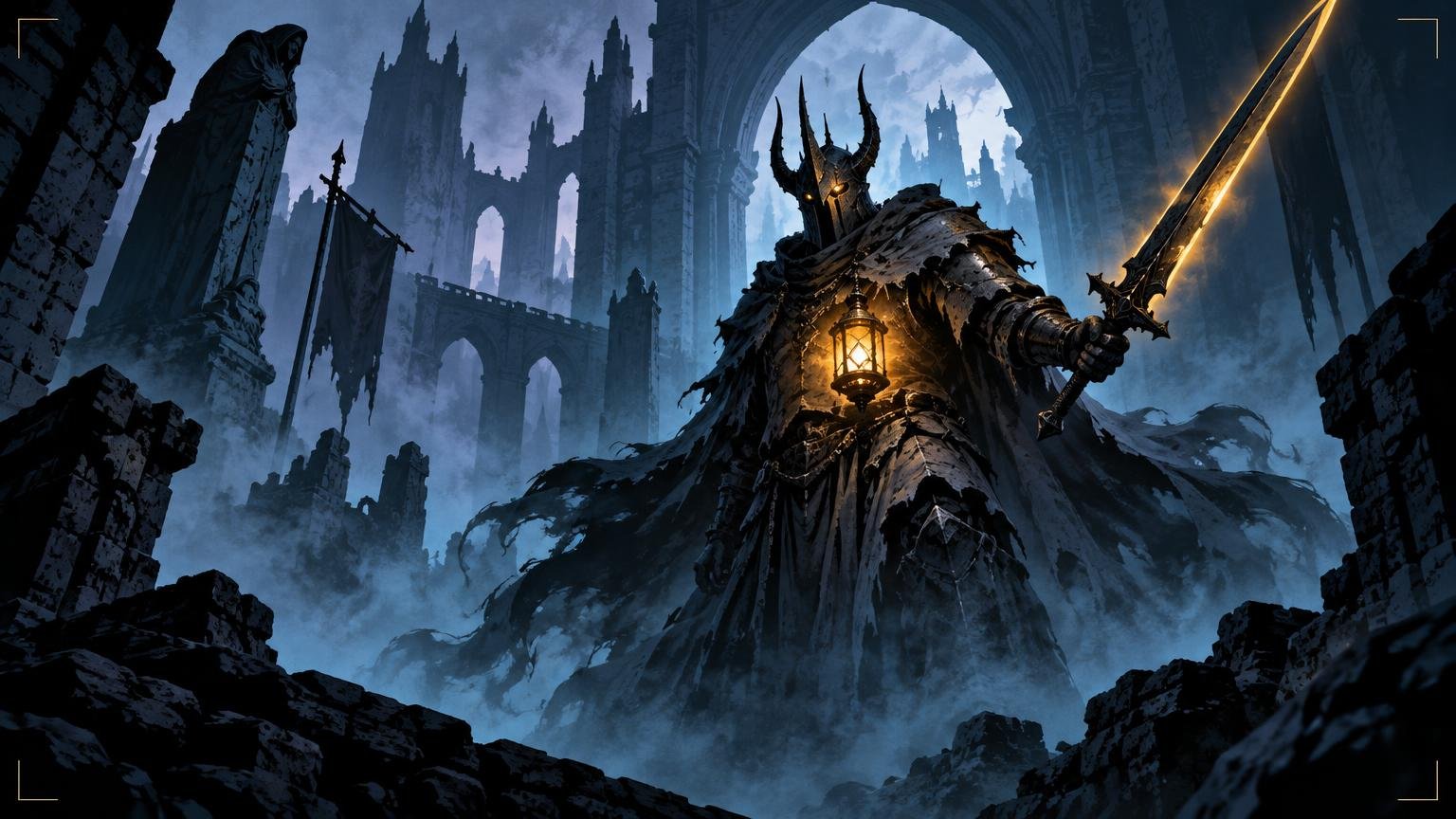
TLDR: Do not brighten the entire painting. Make one story element unmistakable, separate its silhouette, reserve your strongest contrast for it and simplify everything that competes at card size. Darkness keeps its power when it is organized.
A black-armored knight can look magnificent on a monitor and become an unidentified iron vegetable once placed inside a card frame. Making dark fantasy MTG proxy art readable is less about adding light than deciding where recognition happens. The viewer should find the subject, understand the event and feel the atmosphere in that order.
The reliable method is to design one dominant story shape, support it with a controlled path of light and color, and judge every detail inside the intended crop. If that structure survives both thumbnail and physical-card-size review, the painting can remain remarkably dark.
Define the visual job before rendering
Begin with a sentence that describes the visible event, not the lore behind it. “A fallen knight raises a cursed lantern against approaching shapes” gives you something to compose. “The final guardian of a forgotten dynasty confronts his inherited doom” may be excellent flavor text, but it does not tell you what the viewer must see.
Choose one visual carrier for the event: a face, hand, weapon, relic, creature head or spell. This becomes the first destination for contrast, edge sharpness and selective detail. A secondary element can explain the threat, but it should not demand equal attention.
The illustration occupies only part of a card face. The name, type line, rules text and other information all compete for limited visual attention, so artwork that works as a full-screen painting may still fail as card art. Wizards of the Coast’s anatomy of a Magic card shows how many functional elements share that surface.
Before painting further, reduce the idea to three questions:
- Who or what is the subject?
- What is happening at this exact moment?
- Where should the eye land first?
If the sketch cannot answer those questions without costume texture, particles or facial rendering, the foundation needs work. More polished fog will not rescue an uncertain event.
Build the focal story from the silhouette
Dark fantasy often places dark figures against dark ruins, forests or storm clouds. That is tonally appropriate but structurally dangerous. A shoulder can merge with an arch, a sword can disappear into a tree trunk, and an elaborate crown can become a furry lump against broken masonry.
View the subject as a filled shape. Hide interior detail or temporarily paint the figure as a single flat tone. The pose should still communicate direction and attitude. Look especially for gaps around the head, weapon hand and story object. Small pockets of negative space can clarify a gesture without turning the background into daylight.
Separation does not require a white rim around the entire character. Try one localized device instead:
- Place a quiet patch of mist behind the head and shoulders.
- Let a dim doorway frame the weapon arm.
- Use a warmer or cooler background temperature behind the focal silhouette.
- Light one outward-facing plane while allowing the opposite side to merge into shadow.
- Interrupt a complicated contour with one broad, simple background shape.
I prefer partial separation because it feels atmospheric. A pale outline traced around every buckle makes the figure readable, but it can also make the knight look like a sticker. Let some edges disappear. Preserve the edges that explain identity, gesture and threat.
Make dark fantasy MTG proxy art readable with value hierarchy
Value means how light or dark a shape appears. The common mistake is to spread the full value range everywhere: bright moon, bright eyes, bright sword, bright mist, bright windows and several glowing ravens for moral support. The image is no longer dark in a useful way; it is merely busy against black.
Group most of the painting into a restrained family of shadows and midtones. Then spend the lightest light and darkest adjacent accent near the main event. A cursed lantern might illuminate the bearer’s fingers and a slice of cheek while the torso remains almost entirely grouped. That small relationship can say more than lifting every piece of armor.
Color should reinforce the same hierarchy. A limited cold palette can carry most of the environment while one muted amber accent marks the relic. The accent does not need maximum saturation. It only needs to be more distinct than its surroundings.
| Symptom at card size | Likely cause | First revision to try |
|---|---|---|
| Subject becomes a dark lump | Silhouette merges with the setting | Simplify the background behind the head and gesture |
| Everything glitters equally | Contrast and sharp edges are spread across the image | Reserve the strongest pair of values for the focal event |
| Mood vanishes after correction | The entire image was brightened | Restore grouped shadows and keep only localized separation |
| Spell or relic feels detached | Its light does not affect nearby forms | Carry a restrained version of its color and light onto the hand or face |
| Scene reads as texture, not story | Too many small value changes | Merge minor textures into two or three larger masses |
A grayscale check is useful because it exposes whether hue is hiding weak value structure. Do not treat grayscale as the final truth, however. Two colors with similar values can still separate through temperature, while highly saturated accents can attract attention even when their values are close.
Compose for the card crop, not the full painting
Establish the intended art window early. Standard, borderless, full-art and extended treatments expose different portions of an image, so there is no universal safe composition. Work beneath the actual frame or a faithful planning overlay for the layout you intend to use.
Photoshop’s crop controls can work with fixed dimensions, aspect ratios, resolution settings and presets, which makes a repeatable viewing window practical during editing. Adobe’s crop-tool documentation explains those controls. Guides and snapping can also keep repeated crop boundaries or layout guides in consistent positions.
Keep irreplaceable information away from vulnerable edges. A clipped cloak can feel dramatic; a clipped hand holding the only recognizable relic feels accidental. Likewise, a wing passing beyond the image can make a creature feel enormous, but losing the creature’s head beneath an upper frame ornament merely makes it anonymous.
Test alternative crops before refining. Move the subject slightly off center, enlarge the face or rotate the gesture toward the open part of the frame. The best full painting is not always the best card crop. When a spell must remain the focal point, the pose and empty space around it matter as much as the rendering; the same problem appears in posing a wizard around the spell rather than the anatomy.
Control detail so reduction does not turn it into grit
Detail has scale. A filigreed breastplate, etched sword, rain, distant windows and crawling roots may each look convincing at working resolution. Reduced together, they create a field of tiny contrast changes that competes with the face.
Organize the painting into three detail zones:
- High detail at the focal event: use a few sharp, descriptive marks around the face, hand, relic or creature feature that carries the story.
- Medium detail on supporting forms: describe enough armor, anatomy or architecture to establish material and setting.
- Low detail in atmosphere and peripheral areas: merge foliage, rubble, smoke and distant figures into larger shapes.
This does not mean blurring the entire background. Blur can make forms look soft without making them simpler. Instead, remove unnecessary value changes, combine repeated marks and reduce edge contrast. One broad wall shape is calmer than forty individually shaded stones, even if both remain technically sharp.
Watch effects especially closely. Fog should reveal and conceal large forms rather than covering the scene in pale noise. Rain needs a few directional streaks, not a scratched veil. Magical particles work best when their density and brightness increase toward the event instead of decorating every corner.
Test the artwork beneath the complete frame
Do not approve the illustration against an empty canvas. Turn on the title area, frame ornament, rules box and borders. A beautiful diagonal sword may collide with the card name. A face placed low in the composition may be swallowed by the text area. Pale mist can also make light frame details or text less distinct.
Treat the crop and the whole card as separate design problems. First ask whether the art tells its story inside its window. Then ask whether the finished card has a stable hierarchy. The artwork should not imitate the visual weight of every frame element, and the frame should not sever the artwork’s essential gesture. For the broader layout stage, designing the complete proxy card covers the relationship between art, text and frame.
If you are developing a themed deck or Cube, place several cards beside one another. Darkness should be consistent enough to belong together, but not so uniform that every card becomes the same blue-black corridor. Shared shadow behavior, accent-color rules and edge treatment can create cohesion while preserving different locations and subjects. Mixing fantasy art styles across a Cube expands that system-level review.
Run thumbnail and physical-card-size reviews
The thumbnail test asks whether the broad hierarchy survives severe reduction. Zoom out until fine rendering disappears. In a few seconds, identify the subject, event and first focal destination. If you find the brightest corner before the protagonist’s action, revise the hierarchy.
The physical-size review asks a different question: does the framed card remain usable and visually convincing at its intended viewing size? Display or print a correctly scaled proof according to the requirements of your chosen workflow. Do not judge by zoom percentage alone because monitors, document dimensions and display scaling vary.
Use a short review sequence:
- Squint at the image to merge small details into larger masses.
- View the art alone at thumbnail size and name the first shape you notice.
- Turn on the final frame and check whether any overlay interrupts the focal event.
- Review the complete card at intended physical size without zooming in.
- Place it beside related cards and look for an accidental outlier in brightness, color or crop.
- Return to normal working size only after writing down the structural problem.
That final rule matters. Zooming in too soon seduces you into polishing chain links when the actual problem is that the knight’s head has merged with a gargoyle.
Prepare a reversible artwork handoff
Keep a layered master containing the uncropped artwork, crop guides and any frame-testing overlays. Export a separate flattened version in the dimensions, color settings and file format required by the card-building or production workflow you actually choose. Those requirements should come from that workflow rather than from a generic art tutorial.
If the next step is custom card assembly and ordering, a custom card creation workflow such as PrintMTG can provide that handoff destination. The visual work should already have passed its crop, overlay and physical-size checks before production settings become the main concern.
Confirm that you have permission to use the artwork before uploading, printing or distributing it. Original visual art can be protected by copyright, and ownership or reuse rights depend on the applicable license or agreement. The U.S. Copyright Office’s guidance for visual artists provides a useful general introduction to authorship, ownership and copyright, but a specific license or contract controls what it permits.
The final decision
Put the framed card at physical size and look once, without zooming. If you cannot identify the subject, the event and the first focal point, do not solve the problem by brightening everything. Revise in this order: silhouette, crop, local contrast, color accent and detail hierarchy.
The goal is not to make darkness harmless. Keep the swallowed corridors, wet armor, dying fire and suspiciously theatrical ravens. Give that darkness a structure, then let one decisive shape tell the story.