
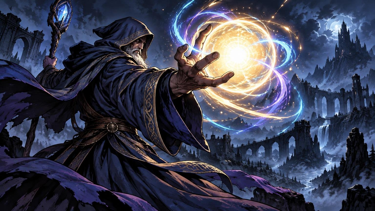
TLDR: The spell should be the largest visual event, the strongest concentration of contrast and the destination of the wizard’s gesture. Build the pose from that destination backward. Keep the body readable but quieter, aim the head, hands and major costume shapes toward the magic, then test the image in grayscale and at card size before rendering anatomy or embroidery.
A wizard can have a magnificent cloak, beautifully articulated fingers and enough buckles to alarm a blacksmith, yet still fail to cast anything visually convincing. The fantasy wizard pose spell focal point problem appears when the figure performs more loudly than the magic: the anatomy, face, staff or costume catches the eye first, while the spell becomes decorative mist near the edge.
The answer is not to hide the body or abandon anatomy. It is to give the body a supporting role. Treat the spell as the primary shape, light source and story event. The wizard’s pose should explain where that power comes from, where it is going and what it costs to control.
The fantasy wizard pose spell focal point rule
Place the spell first, then construct the wizard as a directional system around it. The Metropolitan Museum of Art’s composition material describes composition through the arrangement of elements, including figure placement, perspective, color, light and shadow. That broader view matters here: a casting pose cannot establish hierarchy by itself if the background, lighting and costume contradict it.
I would begin with three anchors: the spell, the casting hand or tool, and the head. Connect them as an asymmetrical triangle. The spell occupies the dominant corner. The hand creates the clearest route into it. The head supplies intention without demanding top billing.
A useful hierarchy is spell first, gesture second and identity third. Viewers should immediately see that magic is happening, then understand how the wizard is producing or resisting it, and only then inspect the character’s face and clothing. This order is especially valuable for card art, where a reduced crop has little room for competing performances.
Design the silhouette before drawing anatomy
Start with three to six tiny thumbnails made from flat shapes. Draw the wizard as a dark mass and the spell as one pale or colored shape. Do not add facial features, fingers, runes or folds. If the idea cannot survive this crude treatment, more rendering will only give the confusion better tailoring.
- Place the spell shape and reserve clean negative space around its most important edge.
- Add a simple torso mass that leans toward, braces against or curves around the spell.
- Connect the shoulder and casting arm with one clear directional sweep.
- Add the head as a smaller shape whose tilt reinforces the action.
- Check whether the free arm, staff or cloak creates a second competing gesture. Simplify it if it does.
Avoid placing every limb at equal distance from the torso. A symmetrical spread can make the wizard look like a model displaying a costume. Compression on one side and extension on the other create force. For a projected bolt, for example, push the casting shoulder forward and let the rear shoulder recede. For a contained orb, curl both arms around the spell while leaving enough negative space for the orb to remain distinct.
The casting hand may overlap the spell slightly when overlap clarifies contact, but it should not divide the magic into several fussy pieces. Keep at least one major portion of the spell silhouette clean. A hand touching the lower edge of an orb reads as control; five bright fingers scattered across its center may read as visual static.
Choose a pose by the spell’s narrative function
There is no single correct spellcasting pose. The best construction depends on whether the magic is being launched, compressed, summoned, redirected or endured. Choose the verb before choosing the anatomy.
| Pose type | What it communicates | Main focal risk | Useful correction |
|---|---|---|---|
| Forward projection | A bolt, beam or force released toward a target | The extended arm becomes a strong bar across the image | Angle the arm toward the spell and let the brightest event sit beyond the hand |
| Compression or ritual | Power being contained between the hands | The face and symmetrical shoulders can dominate | Lower the head, vary the hands and give the spell an uneven living contour |
| Staff relay | Energy traveling through a prop | An ornate staff steals attention | Reduce staff contrast and reserve the brightest accent for its point of magical contact |
| Over-shoulder cast | Speed, pursuit or a backward strike | Foreshortened anatomy becomes the spectacle | Simplify the near shoulder and keep the spell isolated against a calm shape |
| Summoning | A creature, portal or structure emerging | The summoned subject competes with the initiating magic | Use one dominant emergence edge and subordinate secondary particles |
| Defensive ward | Resistance, pressure and protection | A large shield effect hides the figure completely | Show a clear contact point where the ward bends, cracks or catches the incoming force |
The wizard’s gaze can follow either the spell or its target. Looking at the spell suggests careful control, surprise or dangerous instability. Looking toward the target suggests confidence and intention. What matters is that the eye line participates in the same visual route as the hands and torso. A face looking out toward the viewer while every other shape points sideways creates an unnecessary second story.
Use perspective and scale to support the magic
Foreshortening is useful when it makes the spell feel close, fast or forceful. It becomes a distraction when the near hand grows into the largest and most detailed object in the crop. Exaggerate only what advances the magical action. A large near hand can work if its fingers frame a spell beyond it, but the hand should usually remain simpler and lower in contrast than the spell.
Depth can come from overlap before it comes from construction lines. Let a sleeve cross the torso, the hand cross a quiet edge of the spell and the spell cross a subdued background shape. Keep those overlaps selective. A dozen intersecting straps, fingers, sparks and architectural lines will flatten the image into one busy layer.
Perspective tools are optional construction aids, not a certificate of dramatic wizardry. Procreate provides adjustable 2D Grid, Isometric, Perspective and Symmetry guides, which can help align architecture, a staff or a strongly foreshortened casting direction. A loose floating pose against mist may need no formal grid at all. Use a guide when the space must remain convincing, then hide it before it begins dictating every organic curve.
Scale also comes from environmental reaction. Bend smoke around the spell, push cloth away from a magical blast or cast a small figure-like shadow against a large portal. These cues make the magic affect the world rather than float above it like a luminous sticker.
Build the value structure before the glow
A bright spell still fails when everything around it is equally bright. The important question is not how white the magic becomes, but where the strongest local contrast occurs. Place a dark or restrained value next to the spell’s critical edge. Keep the wizard’s main body grouped into a readable middle or dark value, then introduce spill light only where it describes contact.
A convincing glow needs structure. Give it a compact bright core, a more descriptive middle zone and a soft outer influence. If the entire effect becomes a white cloud, the viewer loses its shape, direction and scale. Preserve darker gaps between branches of lightning, readable interior shapes within a portal or a defined rim around an orb.
Spell light should touch the nearest planes first: fingertips, knuckles, cheekbone, sleeve edge or staff head. It should weaken across more distant forms. This gradient ties the wizard to the event while preventing the whole costume from becoming equally illuminated. I would rather lose half the rim light than let every cloak edge glow like enchanted piping.
Check the image in grayscale before adding more effects. If the face, belt buckle or staff ornament has a sharper light-dark break than the spell, reduce that competing contrast. Fantasy artist Vwei has described developing a key character through facial detail, saturation, contrast, lighting and focal-point design while enriching surrounding objects and background separately. That is a useful example of staged hierarchy: important areas can be developed deliberately rather than finished everywhere at once.
Control the palette instead of adding more colors
Choose one dominant spell hue and a small supporting family. A cyan spell might use blue-green transitions with a restrained violet accent. A fire spell may move through deep red, orange and a compact yellow core. Introducing unrelated colors into every spark makes the effect feel miscellaneous rather than powerful.
Warm-versus-cool contrast can help, but it is not an automatic focal-point switch. Color appearance changes with illumination, reflected color, atmospheric conditions and neighboring hues, as the Smarthistory color theory discussion explains. A blue spell against an orange scene may still disappear if both share the same value and saturation. Establish the value hierarchy first, then use temperature to reinforce it.
Keep support colors quieter. If the spell is saturated violet, consider muting violet embroidery elsewhere or shifting it toward gray. Repeated color can unify an image, but repeated peak saturation creates several equal invitations for the eye.
Apply detail as a gradient
The highest concentration of useful detail belongs where the magic changes something: the edge where a hand touches an orb, the fracture in a ward, the curling silhouette of a summoned creature or the point where a beam leaves a staff. Medium detail can clarify the wizard’s expression and role. Distant architecture, jewelry and fabric patterns should become broader and calmer.
This does not mean blurring everything outside the spell. Preserve enough anatomy to sell weight and intention: a convincing shoulder angle, a planted foot, a hand with a readable grip and a torso that balances the force. You do not need to display every muscle group. Anatomy succeeds here when it makes the spell feel caused rather than pasted in.
If the staff is stealing attention, reduce its edge sharpness, internal contrast or ornament frequency. If the face dominates, soften the light around the eyes or turn the head slightly away from the viewer. If a cloak commands the crop, merge some folds into one larger shadow mass. Each correction removes a rival rather than making the spell progressively louder.
Refine the focal point without damaging the painting
Make late tonal and color corrections non-destructively where possible. Photoshop adjustment layers can be targeted with masks, and mask values control how strongly an adjustment appears in different areas. This allows a local contrast or color pass around the spell without permanently repainting the entire image.
In Procreate, Screen mode brightens underlying content, lowering layer opacity softens the result, and Color mode applies hue and saturation while retaining underlying luminosity. These behaviors make separate layers useful for restrained glow and color experiments. They are not substitutes for a sound value design: a Screen layer spread across half the canvas can flatten the hierarchy just as efficiently as opaque paint.
Keep the core effect, spill light, particles and color adjustment on distinct layers when the software and workflow allow it. Then you can reduce particles, tighten the halo or shift the hue without rebuilding the pose. If the finished illustration will later be enlarged, preserve natural transitions and material texture rather than polishing every surface into the same synthetic smoothness; the workflow in upscaling fantasy art without making it look plastic covers that next-stage problem.
Run four card-scale tests before finishing
A dramatic full-screen painting can become a polite smudge when reduced. Test the crop early, not after rendering every rune. The exact production setup may vary, but the visual question remains constant: can the image communicate spell, direction and caster at the size where it will actually be viewed?
- Thumbnail test: Reduce the image until costume details disappear. The spell should remain the first readable event.
- Grayscale test: Remove color from the preview. The spell should retain a distinct value shape and strong local contrast.
- Squint or blur test: Soften small details. The body should become one supporting mass while the magical action remains directional.
- Mirror and crop test: Flip the canvas and preview the intended card-art crop. Look for tangencies, trapped negative spaces and important gestures lost near the frame.
If the reduced image reads as “wizard standing there,” return to the silhouette and value grouping. Do not solve a structural failure with more sparks. Move the spell farther from the torso, open negative space around the casting hand, simplify a bright costume panel or change the body lean so the gesture has an unmistakable destination.
For alternate art centered on a known character, the spell should also express the character’s story rather than act as a generic special effect. A disciplined healer may contain light between careful hands; a reckless pyromancer may pitch forward as the fire outruns the gesture. The process for building alternate art around a legendary creature’s story can help turn that pose into a more specific narrative moment.
The final decision
Keep the pose only if the spell is the first readable event in both grayscale and the small-format crop. The anatomy must explain force, direction and intent, but it does not need to audition for a figure-drawing prize in every limb. If the eye lands on a face, hand, staff ornament or glowing buckle first, quiet that competitor before making the magic brighter.
Return to the simplest version: one dominant spell shape, one clear gesture into it and one controlled route for the eye. When those three elements survive reduction, the wizard no longer looks like a costumed figure accompanied by an effect. The entire image becomes an act of magic.
References
- Composition
- Create — Procreate Handbook
- How to achieve creative alchemy: Vwei reveals his process for striking fantasy game art | Creative Bloq
- Smarthistory – Neo-Impressionist Color Theory
- Use layer masks for targeted adjustments in Photoshop | Photoshop
- Adobe Learn – Learn Photoshop – Fine-tune an image adjustment layer
- Blend Modes — Procreate Handbook