
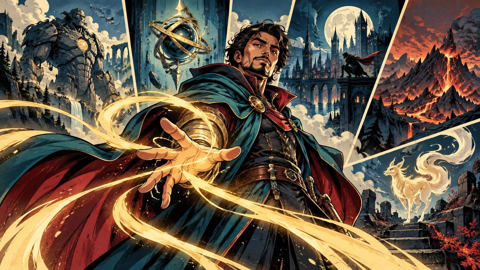
A comic illustration does not become dramatic because every corner contains speed lines, lightning and an alarmingly muscular dragon. It becomes dramatic because the eye knows where to look first.
TLDR: A successful comic style alternate art Commander deck needs one repeatable visual grammar. Choose a comic sub-style, establish rules for linework, value, palette, texture and composition, then make the commander the cover image that introduces those rules. Apply them with different intensity across the remaining cards and judge every illustration at card size.
This guide addresses original custom artwork and personal themed-deck art direction. It is not a guide to recreating an official product, copying published comic panels or presenting unofficial cards as authorized Magic cards. The creative problem is narrower and more interesting: how do you make a commander, spells, lands and tokens look as though they belong to the same illustrated series?
Choose a comic language before choosing individual scenes
“Comic style” is too broad to direct a deck. A bright superhero splash page, a rain-soaked noir panel and a rough sword-and-sorcery comic can all use heavy ink, yet they create completely different expectations. Start by choosing the visual language that best matches the commander’s character and the deck’s play pattern.
| Comic direction | Useful visual traits | Natural deck fit |
|---|---|---|
| Superhero action | Clean contour lines, bold foreshortening, explosive shapes and bright accent colors | Commanders built around combat, transformation or spectacular signature moves |
| Dark-fantasy graphic novel | Ragged inks, deep shadows, restrained color and severe silhouettes | Graveyards, sacrifice, curses, demons and tragic legends |
| Retro pulp | Warm paper tones, limited spot colors, printed texture and theatrical poses | Adventures, artifacts, treasure and knowingly melodramatic villains |
| Noir | Black value masses, narrow pools of light, rain, smoke and suspicious doorways | Espionage, theft, political play and commanders with hidden motives |
| Manga-inspired fantasy | Economical backgrounds, expressive faces, directional effects and sharp shape language | Character-led decks with emotional turns, duels or escalating power |
Write a one-sentence direction that excludes as much as it includes. “A cold noir fantasy with black shadows, pale cyan magic and one red clue per scene” is usable. “Dynamic comic art” is not. The first statement can settle arguments about color, lighting and background detail before those arguments spread across 100 cards.
Comic influence also has precedent within Magic’s visual history. Wizards described early Magic artist Christopher Rush’s work as comic-book-inspired, while later alternate treatments have drawn explicitly from comic covers and high-contrast silhouettes. Those examples show that comic energy can come from composition and contrast, not merely speech balloons or printed dots.
Build a visual rulebook for the whole deck
A Commander deck uses a commander alongside a 99-card deck, with color identity shaping deck construction. Wizards’ official Commander overview explains the format structure. From an art-direction perspective, that scale makes consistency a systems problem. You cannot solve it by giving every card the same border and hoping the illustrations become friends.
Create a one-page rulebook covering six decisions:
- Line hierarchy: Use the heaviest contour around the main silhouette, medium lines for interior forms and lighter marks for texture. If every brick and belt buckle receives the same black outline, the focal character dissolves into visual gravel.
- Value structure: Decide whether the deck favors bright figures against dark settings, dark silhouettes against luminous skies or another repeatable contrast pattern. Large light and dark masses survive reduction better than scattered highlights.
- Palette: Select a dominant neutral range, a small family of supporting colors and one accent reserved for important effects. The accent might identify necromancy, clues, fire or the commander’s influence.
- Texture: Choose halftone, crosshatching, dry-brush ink, screen tone or distressed paper as a supporting finish. Texture should bind the cards together without covering faces, symbols or critical silhouettes.
- Composition: Define preferred camera angles and focal placement. You might use low angles for legendary creatures, lateral action for combat tricks and centered emblematic views for artifacts.
- Recurring motif: Repeat one shape or device, such as crescent shadows, torn panel edges, diagonal rain or circular spell glyphs. One motif is identity; six motifs are a stationery cupboard falling down the stairs.
If multiple illustrators will contribute, turn these choices into a concise mini style guide for artists working on one deck. Include a few approved examples, but describe what each reference demonstrates: cropped perspective, thick outer contour, limited red accent or quiet negative space. That gives an artist a controllable target without asking for an exact imitation of another artist’s style.
Make the commander the cover image
The commander should feel like issue number one: a clear promise about protagonist, conflict and atmosphere. Show the character doing something only this character would do. A necromancer might stand in a calm pool of light while the dead form a rough black border around the scene. A reckless artificer might lean into a machine whose diagonals threaten to burst beyond the crop.
Three elements should carry from the commander into the rest of the deck: its dominant silhouette logic, its accent color and its recurring motif. Do not repeat the commander’s exact pose everywhere. Repeat its visual laws.
Story matters here. Decide on the commander’s defining tension—duty against ambition, civilization against wilderness, control against chaos—and let other cards show consequences or variations. The process in building alternate art around a legendary creature’s story can help turn that tension into scenes rather than a collection of unrelated portraits.
Reserve the most elaborate composition for the commander and a handful of signature cards. If every mana rock arrives with a double-page explosion, the commander stops feeling legendary. Hierarchy across the deck matters just as much as hierarchy inside one illustration.
Direct each card role differently
Cohesion does not require uniform intensity. Comics use establishing shots, close-ups, silent panels and bursts of action because contrast controls pace. A deck benefits from the same rhythm.
Signature creatures and spells
Give signature cards strong gestures, dramatic crops and the clearest appearances of the deck’s accent color. Place faces, weapons and spell effects away from likely frame interruptions. A blade that disappears beneath a text area can look broken rather than forceful; a face pressed against the upper crop can lose its expression.
Utility cards and artifacts
Simplify. Use emblematic objects, hands performing an action or one readable magical event. These cards appear frequently during play, so immediate recognition is more valuable than a crowded narrative scene. Let the background become a shape that supports the object instead of a second illustration competing with it.
Lands
Lands are the deck’s establishing shots. Repeat architecture, weather, horizon shapes or environmental textures rather than inserting a protagonist into every landscape. A noir deck might move through alleys, rooftops and rain-dark plazas; a pulp deck might use impossible ruins and sunburned skies. For a deeper pass, use these custom land ideas for Commander decks to connect locations to the deck’s story.
Tokens
Tokens need the cleanest silhouettes in the project because several may share the battlefield. Differentiate them by outer shape before interior detail: broad shoulders versus wings, round constructs versus narrow spirits, upright soldiers versus low beasts. Color can reinforce the distinction, but the outline should do the first job.
Test the comic style alternate art Commander deck at card size
A beautiful full-screen illustration can become a bowl of ink noodles when reduced. Test the art inside the intended frame, not as an isolated poster. Zoom out until the card resembles its physical playing size, then look away and back again. The first shape you notice should be the intended focal point.
Run these checks before polishing textures:
- Squint at the card. The main light and dark masses should remain distinct.
- Convert a temporary copy to grayscale. If the focal figure merges with the background, separate their values before adding more color.
- Cover the lower art area where rules text or other frame elements will sit. Confirm that the action still makes sense.
- View several cards together. The palette and ink treatment should feel related, but the silhouettes should not all repeat the same centered pose.
- Place matching tokens and lands beside the commander. They should support its visual promise rather than compete for cover status.
Wizards described one Peach Momoko Secret Lair treatment through its stark black-and-white work and use of light-and-shadow contrast. That is a useful reminder: removing color can strengthen comic storytelling when value structure is decisive. Halftone and screen-tone effects are finishing tools, not substitutes for a readable silhouette.
Brief artists through attributes, not imitation
An effective commission brief describes the desired result in observable terms. Specify subject, action, mood, camera angle, value pattern, palette, line character, background complexity and crop constraints. Instead of requesting “the exact style” of a living artist, explain that you want angular silhouettes, broad black shadows, restrained interior rendering and a single acidic-green magical accent.
Ask the artist what rights the commission includes and record the answer in writing. Relevant questions include whether the work may be reproduced, altered, shared publicly or used on physical cards, and whether attribution is required. Permission to display an illustration does not automatically answer every reproduction or modification question.
Wizards’ Fan Content Policy states that Wizards intellectual property includes its cards and artwork, and its fan-content framework does not include making counterfeit or proxy Magic cards. Treat that policy as context rather than individualized legal advice. Use artwork you created or have clear permission to use, avoid copying comic panels or official card art, and do not represent an unofficial project as an authorized Magic product.
Prepare a controlled final pass
Before producing anything physical, compare the complete deck as contact sheets or small on-screen groups. Look for accidental outliers: one photorealistic face in an inked deck, one neon background in a muted palette or one land with far more detail than the commander. Fix the outliers by returning to the rulebook, not by adding the same filter indiscriminately to every image.
Keep editable artwork and the assembled card project separate. Confirm the requirements of whichever production method you choose rather than assuming universal settings for resolution, bleed, safe areas or file format. When the files have been checked against the chosen provider’s current requirements, printing custom MTG cards can be the next practical stage for personal playtest copies.
Let one visual promise govern the deck
The strongest comic-style deck is not the one with the most effects. It is the one whose commander establishes a visual promise and whose other cards keep it. Choose one comic language, define a small set of repeatable rules, vary the intensity by card role and inspect the result at card size.
Start with the commander and three test cards: one signature spell, one land and one token. If those four pieces feel like different panels from the same world—and each remains readable when reduced—you have a system sturdy enough for the remaining deck.