
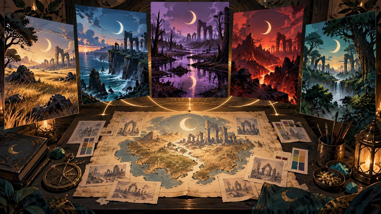
A themed land cycle should feel like several windows opening onto the same world. The landscapes can change, the weather can turn and each color can claim its own territory, but the deck still needs one visual climate. The practical answer is to define a small set of fixed art-direction rules, vary only selected elements and inspect every land together as thumbnails before polishing individual pieces.
Commander makes that system especially visible. A deck contains 100 cards including its commander, follows the commander’s color identity and may repeat basic lands despite the singleton rule. That repetition gives your land art unusual power: it can quietly establish the deck’s setting every few turns. Wizards’ Commander format overview explains the underlying deck rules.
Define the world before designing individual lands
Begin with one sentence describing what every basic land should communicate. Not “gothic lands,” which could mean anything from a moonlit cathedral to a dragon wearing too many iron accessories. Use a specific visual premise: “An abandoned celestial city is being reclaimed by poisonous vegetation under an endless eclipse.” That sentence gives you architecture, atmosphere, narrative tension and a source of recurring motifs.
Translate the premise into a compact visual system with five fixed rules:
- World rule: the place, era and environmental condition shared by every scene.
- Shape rule: the dominant silhouettes, such as needle-like towers, tangled roots or broad stepped ruins.
- Light rule: the direction, softness and color of illumination.
- Material rule: the recurring surfaces, textures and decorative language.
- Motif rule: one small narrative signal that can reappear without occupying every composition.
Keep these rules beside the artwork. They are more useful than a large inspiration folder because they tell you why an image belongs. If a beautiful volcanic palace has the wrong architecture, light and materials, it is still an outlier wearing a convincing costume.
Give each land type a palette role
Cohesion does not require pouring the same color wash over every image. A palette is the actual group of colors in use, while the broader theme carries mood and style. Adobe’s color palette and harmony tools distinguish those ideas and offer structures such as analogous, monochromatic and complementary relationships.
Choose two shared colors for the whole cycle, then give each relevant basic land type one dominant accent. An eclipse deck might share blue-black shadows and tarnished gold light. Plains could lean toward pale ash, Islands toward cold cyan, Swamps toward bruised violet, Mountains toward ember red and Forests toward diseased green. The common shadows and gold highlights hold the cycle together; the accent preserves instant land recognition.
Also assign each group a value pattern—the arrangement of light and dark. Plains may have open midtones and a bright horizon, while Swamps compress most of the scene into darkness around one reflected light. If the deck is intentionally murky, use the techniques in the dark fantasy readability guide rather than lifting every shadow until the mood evaporates.
Plan controlled variation, not visual cloning
Decide what must remain fixed and what is allowed to change. Keep the medium, edge treatment, lighting logic and architectural vocabulary stable. Vary the viewpoint, weather, focal landmark and amount of inhabited detail. Three Forests might show the city’s overgrown gate, a root-filled observatory and a distant district swallowed by canopy. They share a world without becoming triplets.
Official land cycles offer useful models. Kamigawa: Neon Dynasty used ten ukiyo-e basics, two for each basic land type, under a shared treatment inspired by Japanese woodblock printing. Bloomburrow organized four versions of each land type around seasons. March of the Machine repeated Phyrexian symbols in the sky across otherwise different landscapes. The governing rule can therefore be a medium, a time cycle or a recurring narrative event—not necessarily identical compositions.
For a small cycle, I would create a variation matrix before making finished art. Give each image a different combination of shot distance, weather and focal structure. This catches the classic problem where every land becomes “large object in the middle, mist behind it,” a composition that feels dramatic once and suspiciously like a property brochure by the sixth copy.
Coordinate the commander, tokens and special cards
Place the face-up commander beside the lands early. The commander should feel like the principal inhabitant of their world, not a visitor from a brighter expansion. Repeat one or two land motifs in the commander art—perhaps the same eclipse rim light or celestial ornament—but allow a stronger silhouette and more concentrated contrast. The centerpiece can be exceptional without breaking the system; controlled visual exceptions for boss cards explains how to create that hierarchy.
Include recurring tokens, emblems and special frames in the same review. Magic’s showcase treatments can combine alternate art with stylized frame design intended to embody a set’s spirit, so frame language is part of the visual system rather than packaging added at the end. Tokens deserve the same palette and material logic, although simpler silhouettes usually help them read quickly during play.
Build a contact sheet and hunt the outliers
Export every proposed land crop at the same dimensions and arrange the images in rows. Photoshop’s Contact Sheet II documentation describes controls for rows, columns, spacing, rotation and filename captions; Adobe specifically identifies contact sheets as useful visual indexes for comparing multiple images. Other layout tools work too. The important part is simultaneous, equally sized viewing.
Inspect the sheet first at thumbnail size. Squint or temporarily desaturate it and ask:
- Does one image become a bright hole in the set?
- Does one use a different horizon height or camera language without a reason?
- Are two land types too similar in dominant color or silhouette?
- Does a detailed scene turn to visual porridge when reduced?
- Is the recurring motif present often enough to bind the world, but not so often that it becomes a logo?
- Do the commander and tokens appear to inhabit the same visual climate?
Correct the smallest governing feature first. An outlier may need a colder shadow, a reduced highlight, a repeated roof shape or a quieter background—not a complete repaint. Cohesion usually lives in relationships between images, so editing one card while hiding the rest is an excellent way to produce seven individually splendid strangers.
Test a physical group, then document the system
Print or proof several representative cards at their intended physical size and place them together under ordinary table lighting. Include the commander, the brightest land, the darkest land, one token and any unusual frame. Check whether focal shapes survive, adjacent land types remain distinguishable and dark details avoid collapsing. Judge the artwork inside the complete card layout, not as a full-screen illustration; frames, names and rules areas change the available visual weight.
Finish by saving a one-page art-direction sheet. Record the shared palette, accent colors, lighting rule, approved motifs, texture language, framing approach and variation matrix. Add small examples of one successful card and one rejected outlier. When the deck gains a new token or another basic, that sheet prevents the world from slowly acquiring unrelated moons, architecture and weather.
The final decision
Approve the land cycle only when its cards are recognizable by role but inseparable by world. If the contact sheet looks repetitive, increase viewpoint, season or landmark variation. If it looks random, tighten the shared light, materials and motif. Then make the physical group test your final judge: the theme succeeds when the lands, commander and tokens still tell one visual story from across the table.
References
- MTG Commander Format | Magic: The Gathering
- Color Palettes & Themes | Adobe Express
- Collecting Kamigawa: Neon Dynasty | MAGIC: THE GATHERING
- Collecting Bloomburrow: The Four Most Important Things to Know
- Collecting March of the Machine
- Project Booster Fun | MAGIC: THE GATHERING
- Create contact sheets in Photoshop on desktop | Photoshop