
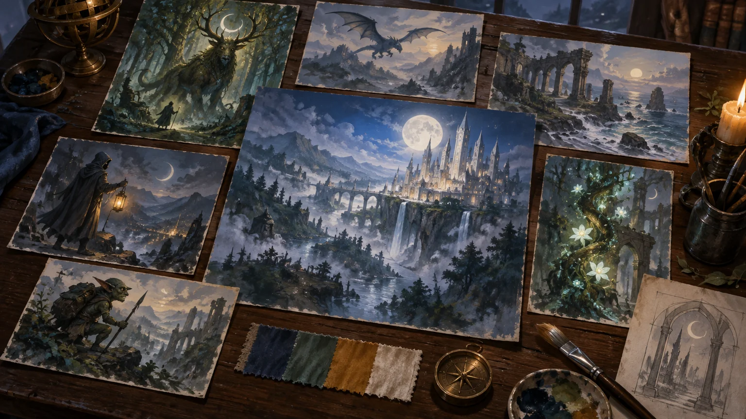
TLDR: A useful style guide artists custom MTG deck creators can share should fit into one or two pages. Define the deck’s premise, three mood words, three anti-mood words, recurring motifs, palette roles, lighting behavior, continuity rules and planned exceptions. Add an annotated contact sheet, then review every illustration together at actual card-art size before approving final work.
A moonlit knight may look magnificent on a large monitor and vanish into silver porridge when reduced to a card. That is the real test of deck art direction: not whether every commission is individually beautiful, but whether its subject reads quickly and whether all the cards appear to inhabit the same world.
The guide should establish a shared visual grammar rather than dictate one painting style. Give artists firm rules about the world, flexible space for interpretation and a small number of deliberate exceptions. Consistency comes from repeated relationships—light against shadow, figures against environments, precious materials against ordinary ones—not from painting every scene teal.
Start with the deck’s visual promise
Before collecting reference images, finish this sentence: “When this deck enters the battlefield, it should feel like…” The answer must describe an experience rather than a genre label. “Dark fantasy” is too broad. “A rain-soaked royal procession crossing a kingdom that has already fallen” gives an artist weather, status, movement and emotional tension.
Reduce that premise to three mood words and three anti-mood words. Mood words define what should be present; anti-mood words prevent an artist from following a technically valid but unsuitable path.
| Direction | Example | Visible consequence |
|---|---|---|
| Premise | A drowned court preserving its rituals beneath a storm | Formal poses, wet stone and fragile ceremony |
| Mood words | Solemn, tidal, tarnished | Restrained expressions, curved movement and worn ornament |
| Anti-mood words | Cheerful, pristine, explosive | Avoid broad smiles, spotless armor and indiscriminate magical flares |
| Primary conflict | Duty against decay | Orderly silhouettes interrupted by water, roots or corrosion |
If the deck concept is still loose, first develop several possible visual identities using these custom MTG proxy art ideas for Commander decks. Choose one central story before commissioning a family of images. Five excellent interpretations of five different premises still make an incoherent deck.
Write rules as visible decisions
Wizards’ published examples of art descriptions use practical categories such as setting, location, action, focus and mood. Some also supply color context or preserve selected constraints while allowing substantial changes elsewhere. That is a useful model because it tells an artist what the image must communicate without prescribing every brushstroke. The Ultimate Masters art-description examples show how concise directions can combine narrative purpose with visual boundaries.
For each commission, write five short lines:
- Setting: Where are we, and what environmental fact matters most?
- Action: What is changing at this exact moment?
- Focus: What must the viewer notice first at card size?
- Mood: What should the scene feel like before the viewer understands every detail?
- Constraints: Which deck-wide rules, recurring objects or exclusions apply?
“A wizard in a ruined city” leaves almost everything unresolved. A stronger brief might read: “On a flooded palace stair, a court diviner holds a cracked brass astrolabe above the water. The astrolabe and her face are the focus. Cold rain surrounds one small amber reflection. Keep the pose controlled rather than theatrical; no glowing eyes or clear blue sky.” The second version gives the artist a focal hierarchy and useful limits while leaving costume design, anatomy and rendering language open.
Choose recurring motifs and exclusions
Select three to five motifs that can change form while retaining meaning. A crescent might appear as a crown, bridge arch, shield notch or gap in the clouds. Repetition makes the world recognizable; variation keeps it alive.
Wizards’ discussion of Ravnica’s visual development describes identities carried through architecture, symbols, motifs and broader design sensibilities that can be extended into new applications. Apply the same principle at deck scale: build a small kit of shapes and materials that artists can reuse without copying one another.
- Shape language: crescents, tall narrow arches and downward-pointing triangles.
- Materials: tarnished brass, dark wet wool and pale river stone.
- Natural motif: reeds bending in one direction, suggesting persistent coastal wind.
- Magic behavior: thin rings and reflections rather than clouds of luminous particles.
- Exclusions: modern buckles, spotless gold, tropical foliage and generic blue energy spirals.
Keep the exclusions list short. It should protect the premise, not become a catalogue of everything one art director has ever disliked. I would rather prohibit one damaging cliché—such as every spell becoming a glowing orb—than bury an artist beneath thirty decorative prohibitions.
Set palette, value and lighting relationships
A palette is not merely a row of swatches. Explain what each color does. If artists receive only “navy, gray and gold,” they may distribute those colors evenly and produce a deck that feels oddly flat. Assign roles instead.
- World color: desaturated blue-green belongs to weather, distance and water.
- Structure color: cool gray belongs to architecture, armor and broad quiet shapes.
- Human accent: muted red appears near faces, hands or personal possessions.
- Sacred accent: amber-gold is rare and reserved for vows, relics or decisive magic.
- Forbidden relationship: bright gold should not cover large backgrounds or compete with faces.
Then define value—the light-to-dark structure of the image. For this example, figures might usually be darker than the mist behind them, while important faces receive one small light shape. Lands can reverse that relationship and use broad dark skies over pale water, giving quieter cards their own rhythm. For more land-specific development, see these custom land ideas for Commander decks.
Lighting rules should answer three questions: Where does ordinary light come from? How does magic alter it? What remains dark? “Overcast daylight with selective warm reflections” is more actionable than “cinematic.” Reserve the brightest contrast for the focal story. When every helmet, wave and raven glows, the spell has lost command of the room.
Separate fixed continuity from artist freedom
Divide recurring design elements into fixed, variable and forbidden categories. This is especially important when characters or locations appear in several commissions.
| Category | What it controls | Example |
|---|---|---|
| Fixed | Features needed for recognition | Character silhouette, damaged left pauldron and crescent staff |
| Variable | Areas where artists can interpret | Fabric folds, facial angle, weather intensity and secondary props |
| Forbidden | Changes that break continuity | Restored pauldron, straight staff or bright white costume |
| Conditional | Changes tied to story progression | Cloak becomes more ragged after the deck’s central disaster |
Provide front, back and profile notes only when those views matter. A full model sheet is unnecessary for a character seen once, but a recurring commander needs a stable silhouette, scale, costume layers and signature prop. For environments, identify horizon height, common building proportions, vegetation and the apparent age of materials.
Do not demand that every artist imitate the same surface treatment. One may use crisp edges and another visible brushwork. The shared world can survive that difference if silhouette, motif, value hierarchy and light behavior remain coherent. That distinction protects both deck identity and the artists’ voices.
Plan the cards that may break the rules
A coherent deck needs hierarchy. If every illustration uses the same contrast and ceremonial amber, the commander cannot feel important. Decide which cards receive exceptions before the commissions begin.
- Commander or central character: may use the largest clear silhouette and strongest sacred accent.
- Signature artifact: may isolate the object against a simpler field than other scenes.
- Board-changing event: may introduce a new light direction or briefly overwhelm the normal palette.
- Legendary supporting cards: may receive one additional motif, but should retain ordinary world materials.
- Basic lands and utility pieces: should usually be quieter, with broader shapes and less focal contrast.
Every exception should preserve at least two anchors. A catastrophic spell might turn the sky amber, for example, while retaining the deck’s crescent shapes and wet-stone environment. The card stands out because one relationship changes; it still belongs because the underlying visual language remains.
Build an annotated contact sheet
Use six to twelve reference images, not a bottomless inspiration folder. Give each image one job: lighting, silhouette, material, environment, composition, atmosphere or “avoid.” Crop references to the exact feature being discussed and annotate them with a sentence.
“Use the narrow rim light on the shoulder” is useful. “Love this vibe” is not. References are visual evidence for a decision, not an invitation to reproduce another artist’s composition. When identifying published Magic artwork or a credited artist, confirm the attribution through an official source such as the Magic set archive rather than relying on an unsourced repost.
Arrange the references on one page beside palette roles and motif sketches. A second page can hold character continuity, commission-specific prompts and the exception map. If the guide becomes a twenty-page encyclopedia, artists may miss the three rules that actually determine whether the image belongs.
Use this mini style-guide checklist
- One-sentence deck premise
- Three mood words and three anti-mood words
- Primary focal story for the deck
- Three to five reusable motifs
- Four to six material or costume cues
- A short exclusions list
- Palette roles rather than color names alone
- Normal value hierarchy and lighting direction
- Rules for how magic emits, reflects or absorbs light
- Fixed, variable, forbidden and conditional continuity details
- A map of cards allowed to break one visual rule
- Six to twelve annotated references with clear jobs
- A five-line brief for each commission: setting, action, focus, mood and constraints
- Agreed file-delivery, revision, usage and credit terms
- A final contact-sheet review at intended card-art size
Review the entire deck at card size
Make a contact sheet containing every approved illustration. Display the artwork using the intended crop, not only as full paintings. Then reduce the sheet until each image approximates its final card-art footprint. This reveals failures that disappear at portfolio scale.
Review the sheet in three passes. First, squint at it and check value grouping: can you find each focal subject? Second, scan for accidental repetition: do six figures share the same pose, or do too many spells occupy the upper-right corner? Third, isolate the key cards: are they prominent without looking imported from another universe?
Also inspect the complete card canvas. Artwork may be clear by itself but collide with a visually heavy frame, crowded rules area or ornate title treatment. The guide to designing better MTG proxy cards explains why image, frame and typography need to be judged together.
If a piece fails at small size, request a specific correction. Enlarge the head and active hand. Lose the bright tower behind the figure. Merge four minor ghosts into one readable shape. Darken the unused corner so the relic becomes the first point of contrast. “Make it pop” gives the artist no dependable target.
Set permissions and credit before final delivery
A commission payment does not, by itself, tell the reader what reproduction, portfolio, modification, printing or resale permissions were agreed. Put the intended uses and credit language in the artist agreement before work begins. Specify whether you may crop the art, add a card frame, make color adjustments, print personal copies, publish images online or use the work in any commercial context.
When a project uses Wizards intellectual property, check the current Wizards Fan Content Policy as well as the artist agreement. The policy includes conditions for fan content, unofficial attribution and the use of Wizards trademarks; it also says counterfeit or proxy Magic cards are not covered merely because they are distributed for free. It further requires respect for intellectual property belonging to other people. Policies and project circumstances can change, so settle the exact permission you need rather than assuming “fan project” answers every rights question.
Turn the guide into a repeatable commissioning tool
Keep the deck-wide rules stable and duplicate only the commission-specific section for each artist. That section should identify the card’s narrative job, focal action, required continuity, allowed variation and whether it receives an exception. The result is quicker to read and easier to compare across assignments.
Once the art is approved, check crops and complete card layouts before preparing the project for custom MTG card printing. Do not let production become the first moment anyone sees all the images together.
Your next step is simple: write the one-sentence premise, choose three mood and anti-mood words, assign roles to the palette and assemble a ten-image annotated contact sheet. Send that compact guide with the first brief, then withhold final art approval until the whole deck passes the card-size review. A shared world is built through a few decisions repeated with care—not by asking every artist to paint the same dragon in the same fog.